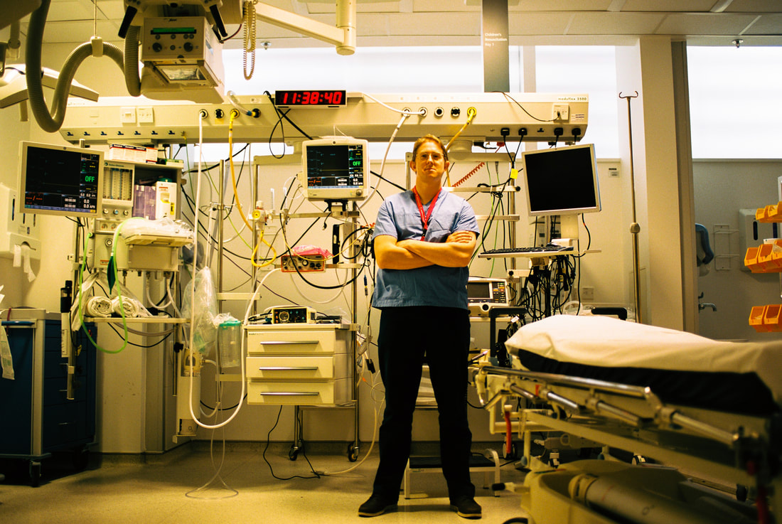
Move all street photography work from documentary project and then the street work form structure. Then put across work from globalisation starting from the dog walking stuff.
BEAUty in society-street photography- 1st Dev
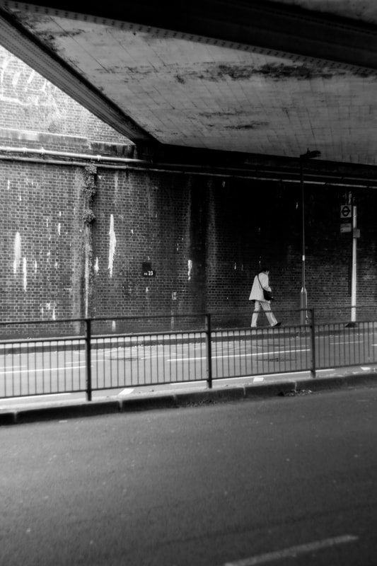
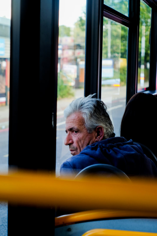
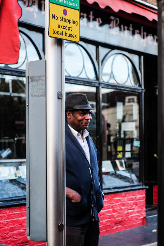
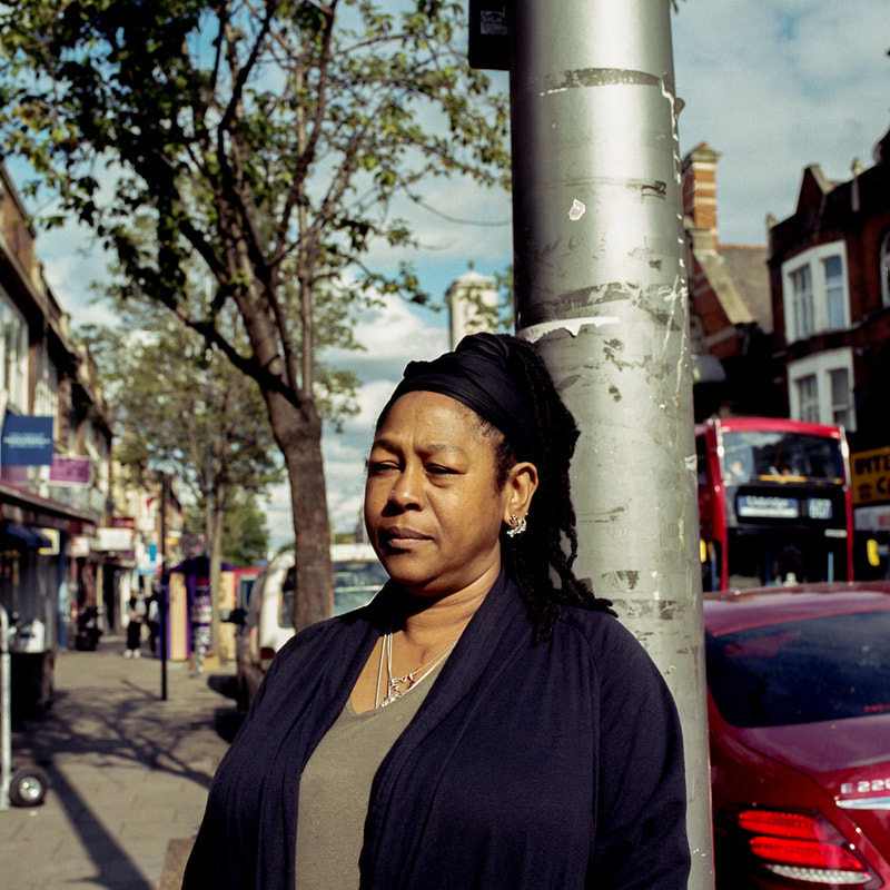
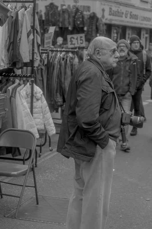
I started off by shooting some street photography around east Finchley and also on buses and around Moorgate. My intention of this shoot was to try and capture people on the street in a slightly isolated moment. The aim was to choose people who are natural in their looks before they might realise I am takin the image. I had to make sure I was not seen so that the pictures appear as natural as possible.
|
|
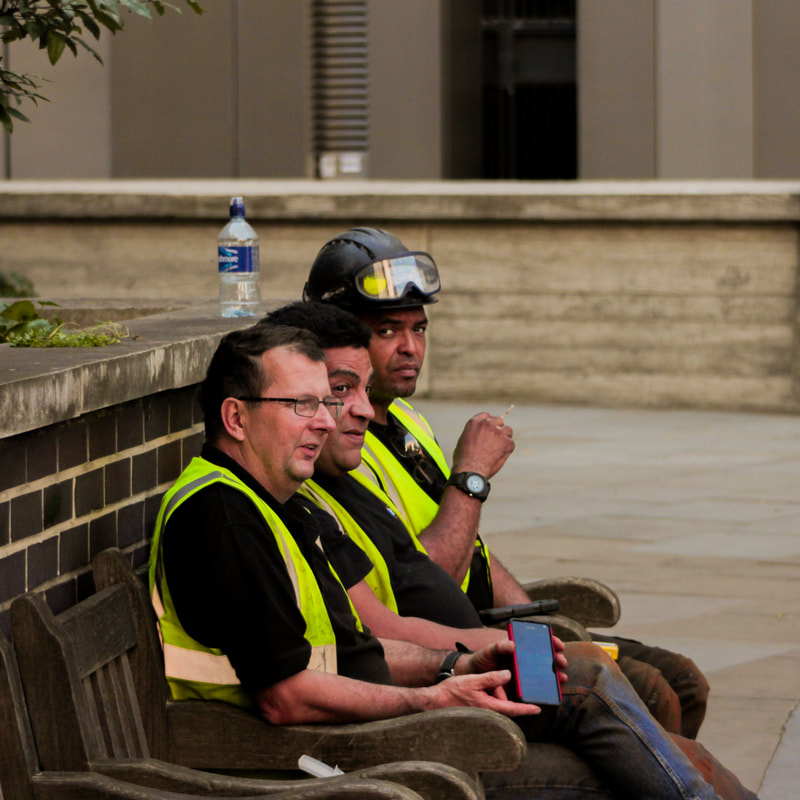
After reviewing the images I felt they were somewhat successful however the amount of image I took did not allow me to explore this fully. I felt the 2nd image on the bus was the most successful of them all. This is because I felt the subject of the image appears natural and it is obvious he has know idea that he is being photographed. My aim was to explore and capture moments that happen in peoples lives and I feel that in this image the subject has a very concerned look on his face. Although we do not know the subject or his context, this gives plenty of room for the viewer to decide and make a story in there head which is something I feel makes a street photograph interesting. The last image however, was probably the worst. This is because the man furthest away from the camera has clearly seen that I am taking a picture making the moment become unnatural. Having said this, you could say that the look he has is a natural reaction which tells the audience more about him. Overall, I dont think this shoot was a massive success as I could have taken plenty more images which would have resulted in more practice of taking street photographs.
Dogs and their owners- 2nd dev
For this shoot I wanted to take on a slightly different approach. Instead of taking more street photographs I wanted to take some more thoughtful images with more intention. I wanted to take some documentary photographs that explored an actual subject rather than street photo's which had a more loose intention. One thing I became interested in was the relationship between Dog owners and their dogs. I contacted a couple of my friends who I knew had dogs and met them to photograph them. Before shooting I knew that I wanted the images to look very detailed as I would be shooting slightly wider so I could fit the full body shot in. I resolved this by choosing to shoot on colour film. I chose Portra 400 as I knew the skin tones would look good along with the greenery. My intentions were not to try and provoke and arise a feeling within the image between the dog and owner as I feel this would make it look unnatural and maybe slightly cliche. I chose to photograph them full body shot and I asked both subjects to gaze into the camera without trying to fake any emotion. This was the result...
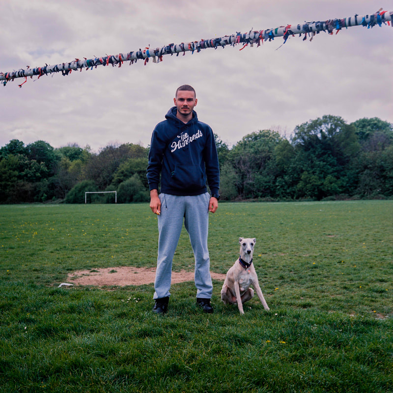
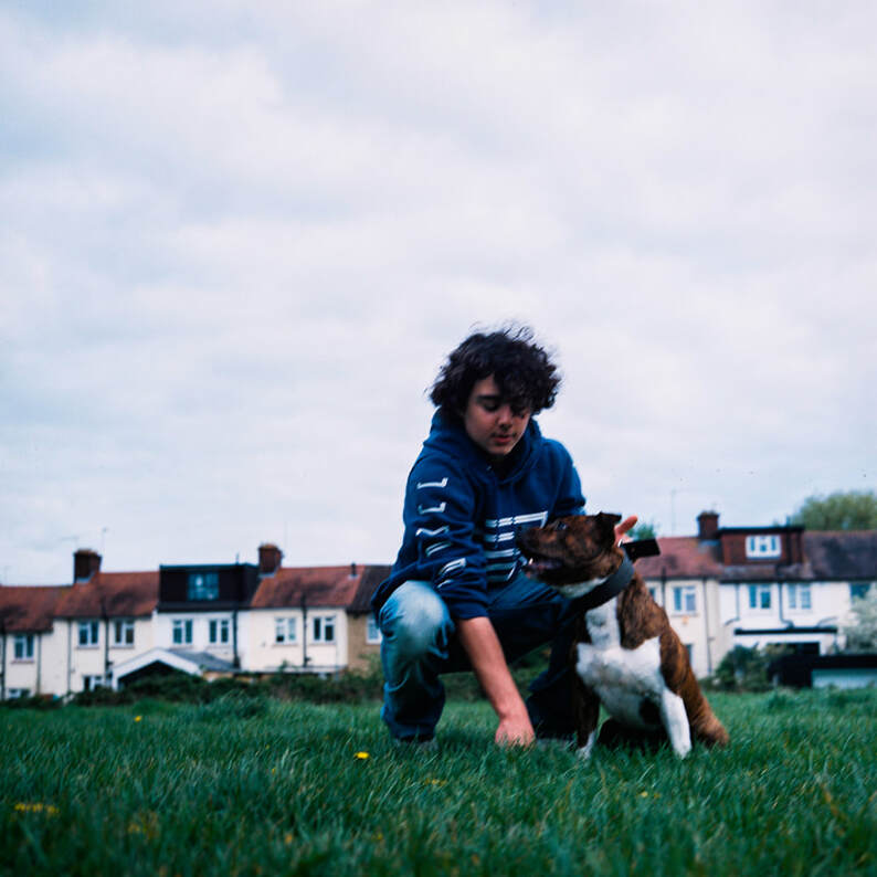
I feel this first image matched my intentions almost exactly. The gaze of the subject was calm and real. What is interesting to me is how both the dog and the owner have the same sort of innocent gaze upon them, both looking directly into the lens. I feel that the colours are very strong and the detail in the grass and the dog would not be as great had I shot it digitally. Some things I would have done differently is probably place the subject on that mud patch as it is placed in an odd position. The subject being placed there would have made it look slightly more correct, compositionally speaking. I also probably would have either placed my camera higher or even lower as the 'horizon' line of the trees and ground is placed at an awkward position. Other than that I feel I capture the relationship very well as it is clear that he is the owner. The images has a feeling of certain trust that they both have for each other, making the image feel real and powerful.
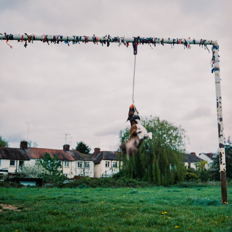
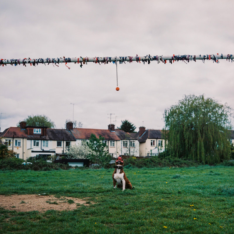
These two images above do not achieve my intentions however it was important tp experiment with different photographs. I chose to photograph the dog on its own to begin with as I felt it had a lot of character and excitement as a dog and I wanted to experiment how I could capture that on camera. For the first image I made sure the shutter speed was not too fast so that I could get a certain amount of movement in the image. That resulted in a very interesting image that captures the dogs playfulness but with this, comes a sense of danger, knowing the context of this dogs breed. Although these images are fairly successful I feel they would have to be presented alongside the image below to provide a bit more context as, the images alone are not very powerful.
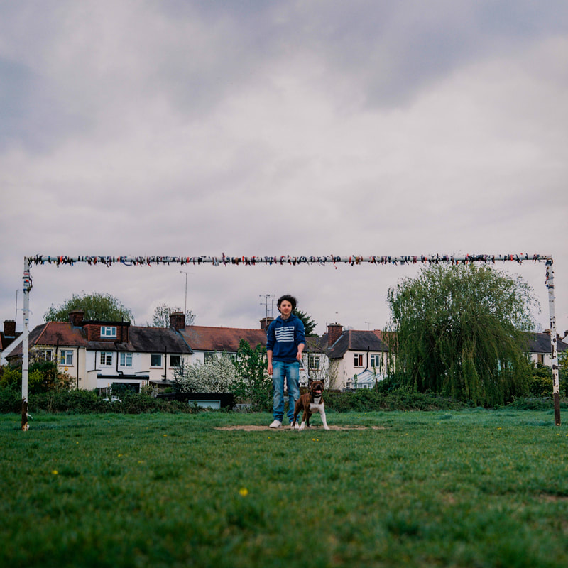
I feel the image above is on the verge of being successful as there are many things I could have adjusted to make this image perfect. To begin with Feel the background is very strong however my placement of the subject could have had a dramatic effect on the image. For example the tree would have provided the perfect backdrop as it would have made the subject stand out a lot more as the houses make him blend in slightly. Also the overall focus on the image was off and left them both out of focus. Had I adjusted these two things I feel I would have had a very strong image. This has forced me to learn that I must consider my placement of subject a lot more before I take the image.
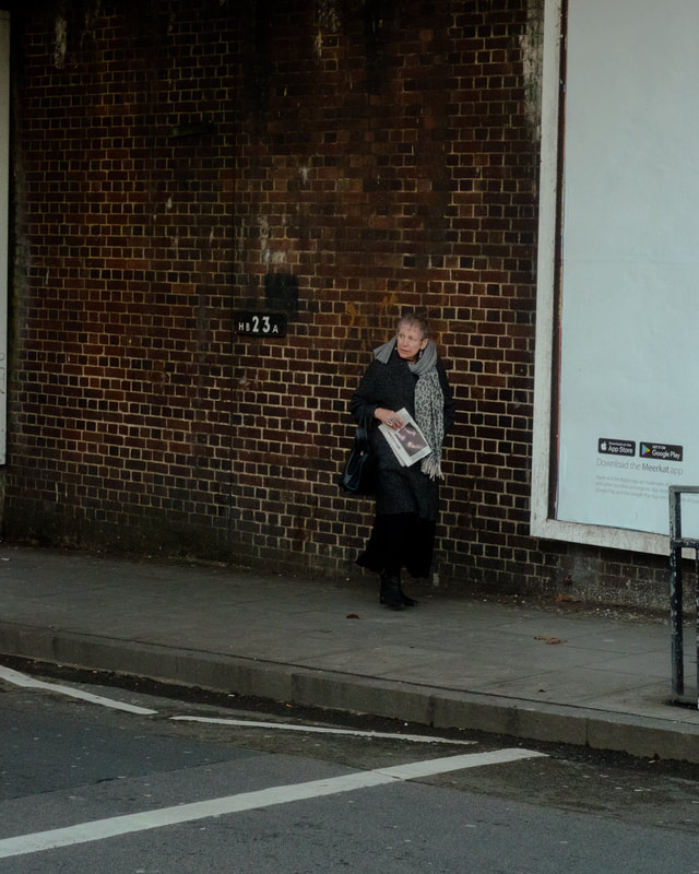
Dog + dog Owners (3rd dev)
For this next shoot I wanted to photograph some more people that I didn't exactly know directly. For this, I went for early morning walks on Hampstead heath as I knew there would be a very large community of Dog walkers. I chose black and white as I felt there would be some interesting textures to create. I also wanted to make sure that the background was slightly more basic like a brick wall. This would give me the option to photograph everyone in the same spot unlike the last pictures were the background was a bit more contextually relevant. This plane background meant I could gather more people and just worry about how many subjects I was photographing.
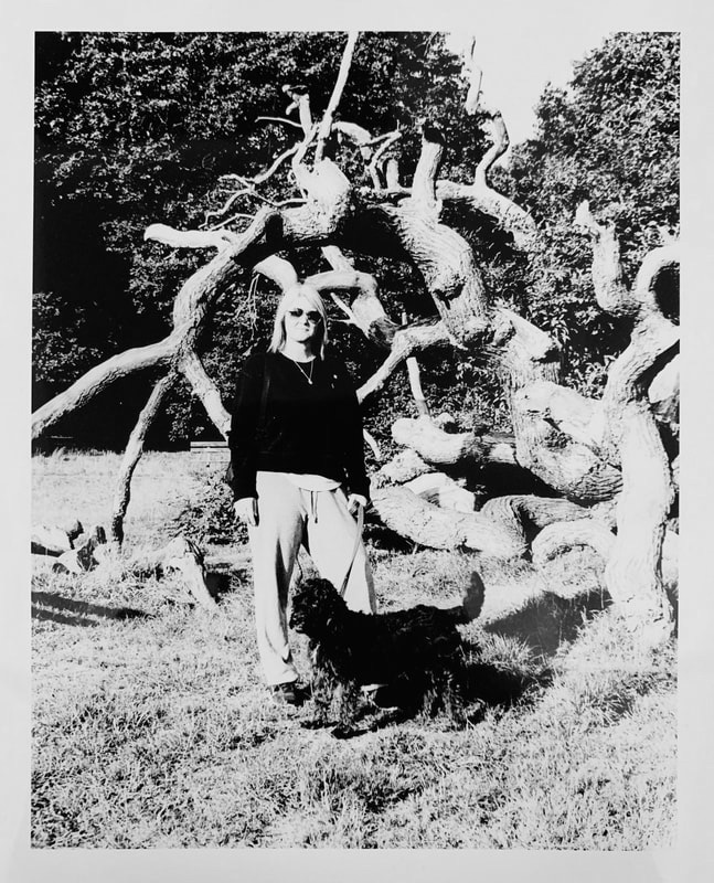
The above shows my favourite image enlarged in a print. Overall I feel the posing of the subject(s) were very successful. The composition was strong however the lighting made the composition fall out of place slightly. For example the main subject was placed in the middle however the strong bright light of the sun was not diffused by anything and caused a massive shadow of the pillar to fall onto them. I feel had I placed the subject just to the side of this, she would stand out a bit more and the shadow of the pillar would create an interesting dimension to the image. Perhaps had this giant pillar been placed on the right of the subject would suggest an absent being in the image or an absent being in both the subjects lives. I feel this change of lighting/composition would have taken this photograph to the next level. For my next shoot I want to explore this relationship further and try and fully bring this out in the image.
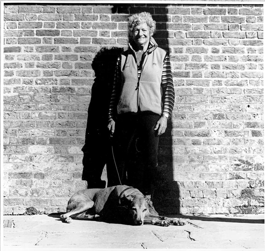
Dog + dog owner (4th dev)
My intention for this next shoot is to try and delve deeper into representing relationships through a photograph. I stuck to Black and white as it had the slightly nostalgic nature that I wanted in my photographs, especially for this shoot as I knew that the main subject had grown up with this dog from a very young age. I organised the shoot to be at their home as I thought this could help bring an element of comfort within the image. During the shoot I tried to make sure that everything was natural without making any compositional compromises that made my last images so unsuccessful.

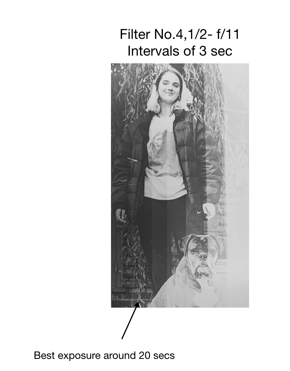
RAW darkroom print (Print 1)
Above is my first print made from this neg. Even after producing a test stip, the exposure on the image above was not correct. I ended up accidentally using a filter of around 3 and using a different paper for the strip than the final print resulted in my exposure being messed around a bit. For the next print I made sure I used same paper for the strip and the print.
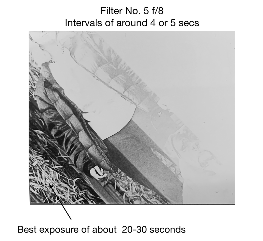
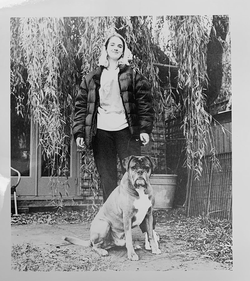
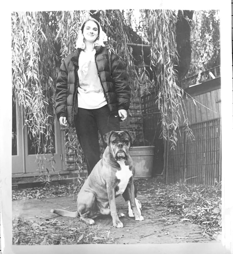
I liked this print however the boarders were slightly off and I wasn't happy with the exposure. I wanted it to be a bit darker for the contrast. I switched back to matte paper as I knew it would end up being slightly darker if I kept the same exposure times. Without another test strip I produced this last print. Compositionally, I am very pleased with the result. The way the dog sits in front of the subject, eyes gazing into the camera suggests he is being protective. This is exactly what I wanted to capture. The connection between human and animal. Along with this, the other subtle elements of the image such as the tree, provide a texturally interesting background and add an interesting dimension to the image. This is seen at its best in the Final print below.

Above shows my final and most successful image of the shoot. I have already spoke about what makes this image strong however I would like to delve deeper into my understanding of what makes this image strong.
At first glance, you can immediately feel the relationship of the human to animal. The dog stands very authoritatively and proudly in-front of the main subject. His eyes are gazing into the lens with a slightly intimiating look. The contrast of the image highlights the dogs strength. The subject herself, placed behind the dog stands comfortably with no fear at all. This shows a certain trust she has with the dog perhaps this trust being built up from when they first met at a very young age. You can feel that the dog is protecting the main subject, letting no one come into contact with her. The subjects expression says that she is untouchable almost provoking someone to try and get past her dog. Because of my relationship with the main subject, I had all the contextual knowledge relevant to creating this image. The context being that Jasmine (main subject) has grown up from a very young age with the now elderly dog. It is only natural for dogs to be protective of their family, especially if they have spent their entire lives with them, completely becoming part of the family.
At first glance, you can immediately feel the relationship of the human to animal. The dog stands very authoritatively and proudly in-front of the main subject. His eyes are gazing into the lens with a slightly intimiating look. The contrast of the image highlights the dogs strength. The subject herself, placed behind the dog stands comfortably with no fear at all. This shows a certain trust she has with the dog perhaps this trust being built up from when they first met at a very young age. You can feel that the dog is protecting the main subject, letting no one come into contact with her. The subjects expression says that she is untouchable almost provoking someone to try and get past her dog. Because of my relationship with the main subject, I had all the contextual knowledge relevant to creating this image. The context being that Jasmine (main subject) has grown up from a very young age with the now elderly dog. It is only natural for dogs to be protective of their family, especially if they have spent their entire lives with them, completely becoming part of the family.
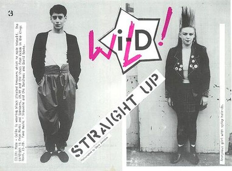
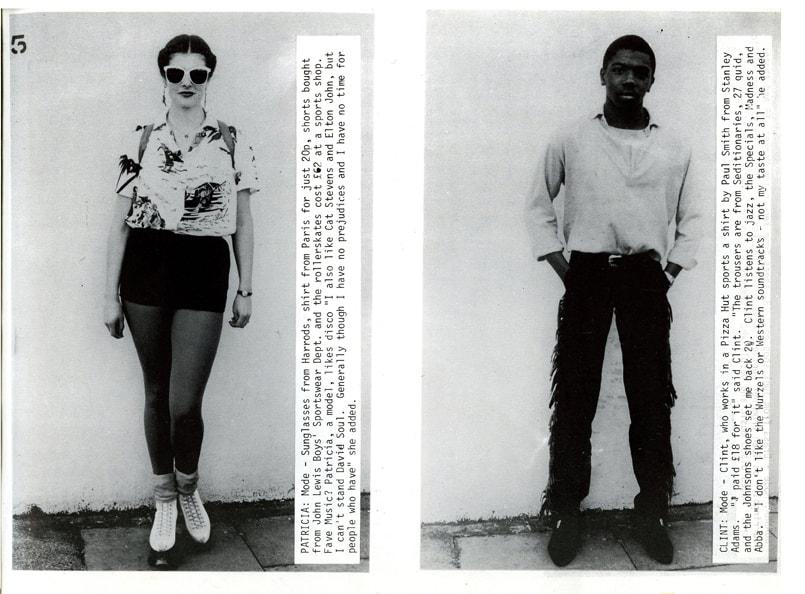
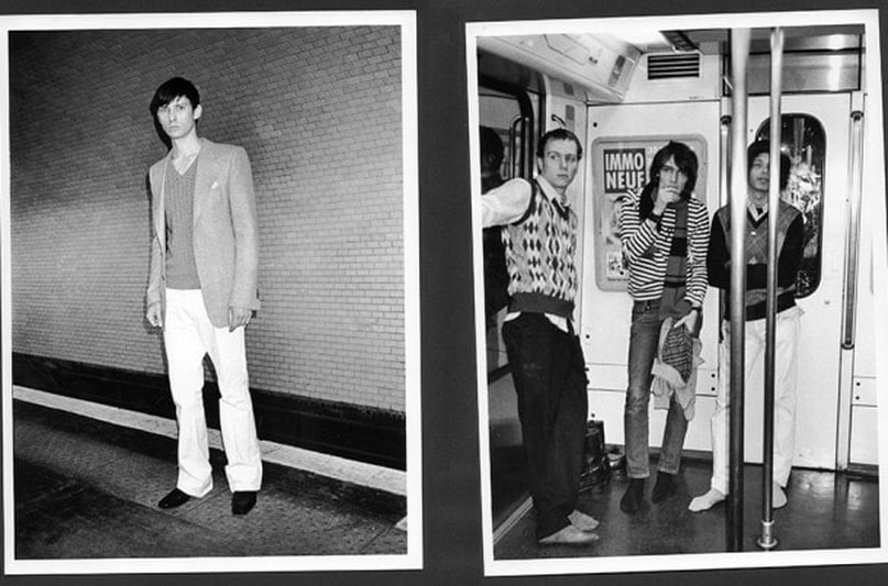
ID MAGAZINE- STRAIGHT UPS
The straight up is an idea in photography that was first used by Photographer Terry Jones, the founder and editor of ID magazine. The style of photography follows a type of documentary photography that includes a full body picture of the subject, often made to show off their outfit. This is accompanied with a short description/interview of the person who talks about what type of music they listen to and where they got certain pieces of clothing. These ID straight ups are interesting to me as I like the way identity is presented the images. The culture really comes out of these images without having to read. This style of photography is something I am interested in achieving in my images.
'Straight ups'- (5th dev)
Below are my first experimentations of the 'straight up'. My main aim was to try and capture my friends and explore the way that fashion and clothing defines them as people. I photographed many of them in a natural urban backdrop to try and make them feel comfortable in front of the camera. I feel what makes the straight ups so successful is the how the subjects appear so natural and the images don't feel posed.
'straight ups'- (6th dev)
'Straight ups'- (7th Dev)
Documentary -Knife Crime (DEV 8)
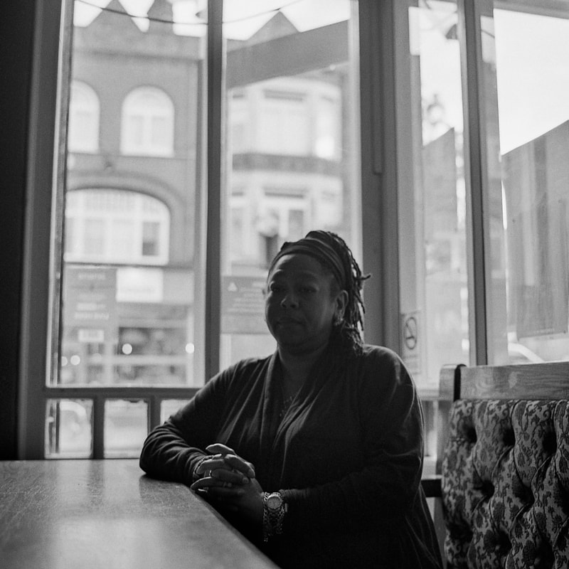
For this shoot I arranged to meet Vanessa Hyman. The mother of Anton Hyman who was brutally murdered and left in a river at the age of 17, it was mothers day,2004. The killers, to this day have not been caught. When contacting Vanessa, I wanted to make sure she met in a place that was comfortable for her. We met in a pub in acton where I was greeted by her family. She made it clear to me that she was willing to help by any means but she will not go to the extent where all her emotions are brought back up. From a photography perspective I think it was important to make her feel as comfortable as possible rather than forcing her to feel emotion that she does not want to feel. I photographed some images indoors in black and white by the window and some colour ones outside. When shooting these images the original format would be 6x4.5 however I knew while shooting that I'd eventually crop these to a 1x1 square format.(4.5x4.5). I did this because I wanted the Focus to be on Vanessa and her emotions visible, the background was less important. Although the face is underexposed, I was able to bring some more exposure in by editing the image slightly. The darkness in the face was not a problem for me as her expression feels quite dark and the emptiness of the background and the absence of light adds a different dimension of darkness and sorrow to the image
|
|
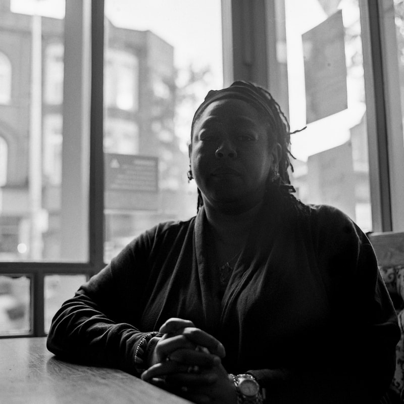
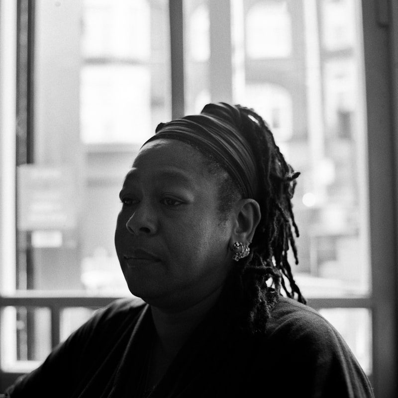
One thing I learnt from this shoot is to not be so shy in directing the subject. For example the exterior shots I placed Vanessa in front of a pole as It acted as a a backdrop however in the final image the pole looked odd and unnecessary as it looks like it is coming out the top of her head. The interior shots were my favourite however I think I need 1 or 2 more stops of exposure bringing out the features a bit more and this could have added a slightly more textured image. Apart from this I like the darkness and emptiness of the photo as from speaking to her, I think this is how Vanessa feels knowing that her sons killers are still out in public. Meeting Vanessa was an eye opening experience that left me shocked and more informed of this topic only making me want to explore it in more depth. Vanessa spoke to me about her opinions on how the government could reduce government and she was adamant that the work to be done was in early intervention and communities. This inspired my Next Shoot.
Documentary-Knife Crime (9th Dev)
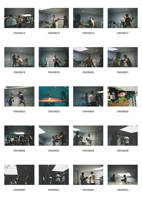
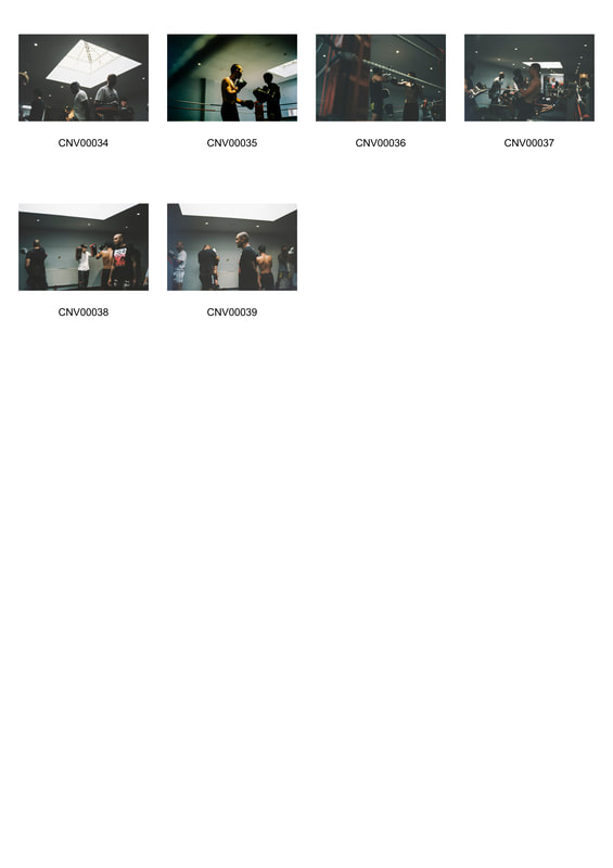
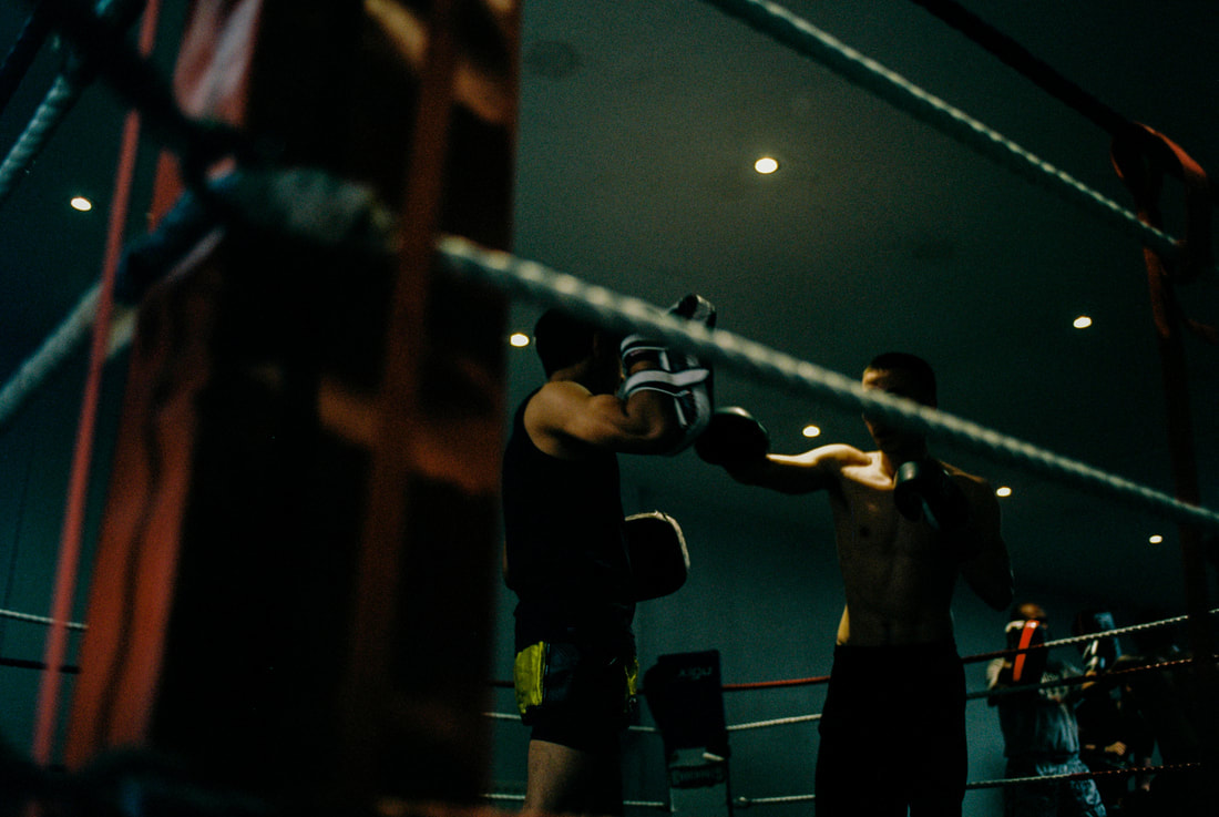
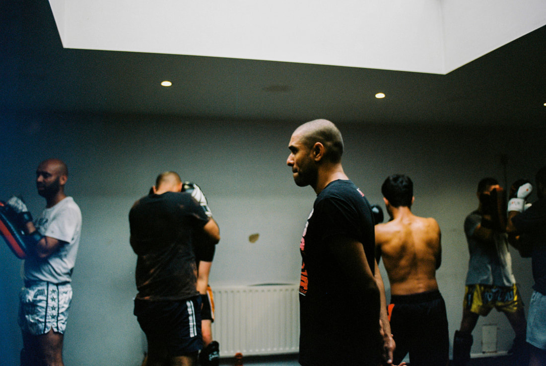
From the previous shoot, Vanessa informed me of the way many people are starting fighting clubs as a means of creating tight knit communities that give younger people a sense of self and makes them more confident of there capabilities as a human being that can deter them from resulting to crime. Having gathered this information and opinion, I looked into small fighting communities around London. I contacted an old friend who I knew was a fighter at a Barnet Martial arts gym. He invited me to come and photograph him and the gym. The shoot was extremely challenging technically. As I was shooting on ISO 400 film, It was hard to keep my shutter speed high without making it too dark. The lights in the gym were halogens, that gave of small amounts of light. They did have some soft natural light coming in from the skylights which helped in certain areas of the gym but it was minimal. My light reading read 2.8 (wide open on my lens) and a shutter speed of around 1/60-1/125. The minimum I could get a way with while still capturing a moving subject was 1/125. This gave me know room to over expose or even adjust exposure for different compositions. I kept my camera at this shutter speed as it was as low as High as I could go in the whole of the gym. This worked quite well when I was shooting towards the skylights which was lucky as the boxing ring was places right next to it giving me some strong light.
I shot one roll of Portra 400,one roll of FUJI 400H and One roll of B&W Kodak Tri-x.
I shot one roll of Portra 400,one roll of FUJI 400H and One roll of B&W Kodak Tri-x.
|
|
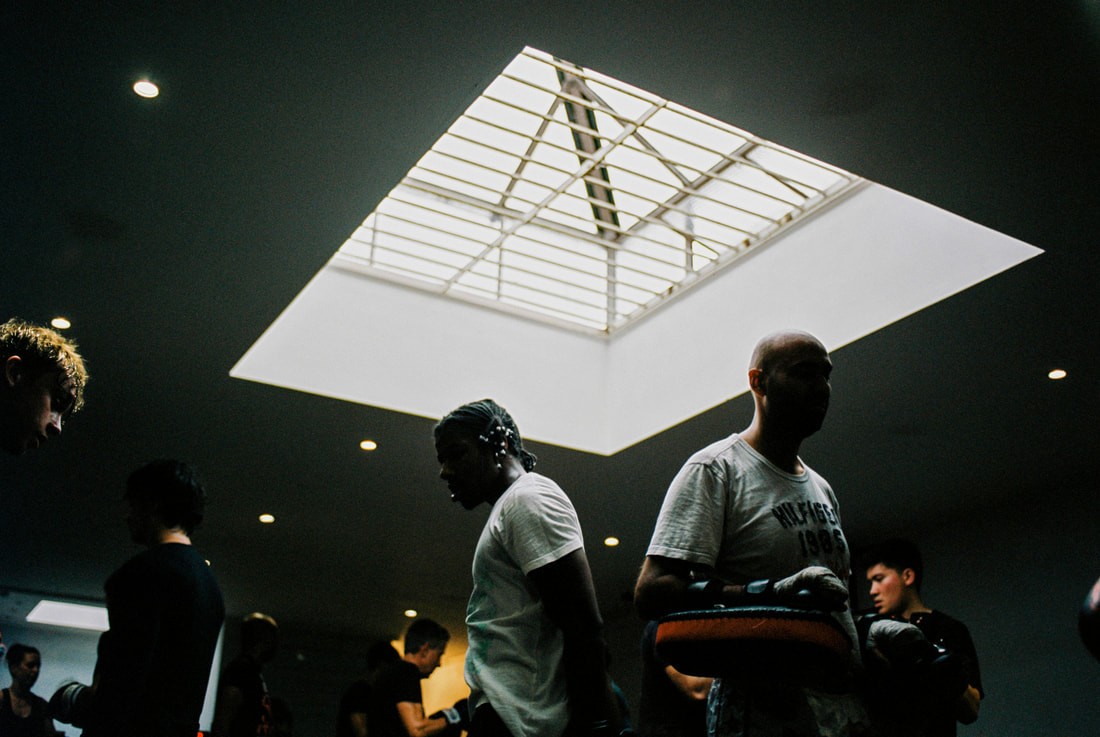
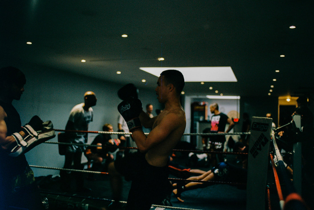
The result of this poor lighting actually turned out quite well. I noticed that the Tri-x handled the exposure the best and so did the Portra 400 however the Fuji roll was almost unusable. The light created nice outlines of the subject and this gave the skin more texture. In post, I gave the images a bit more exposure and contrast. I also made the temerature sligtly cooler. Overall, I was quite happy with this shoot even though it was hard to capture moving subjects in focus and with enough light.
documentary-knife crime (10th DEv)
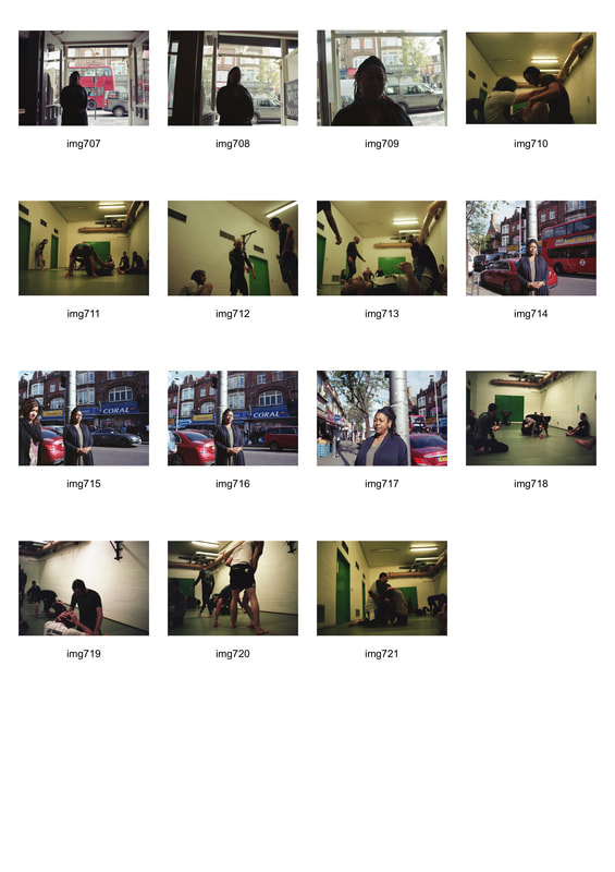
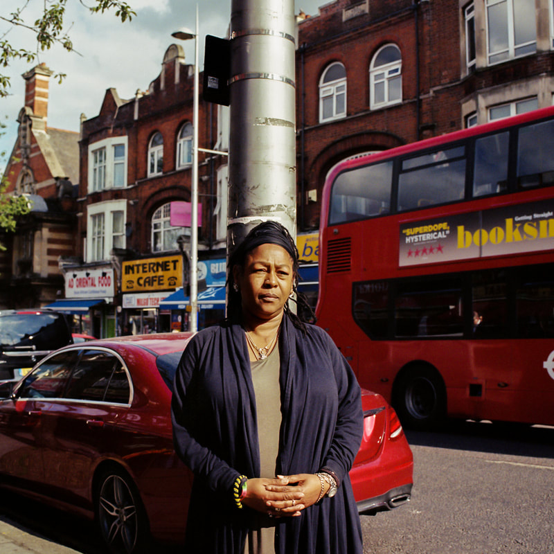
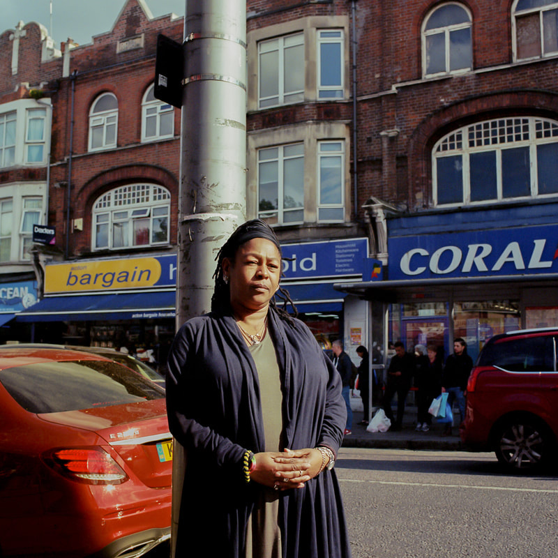
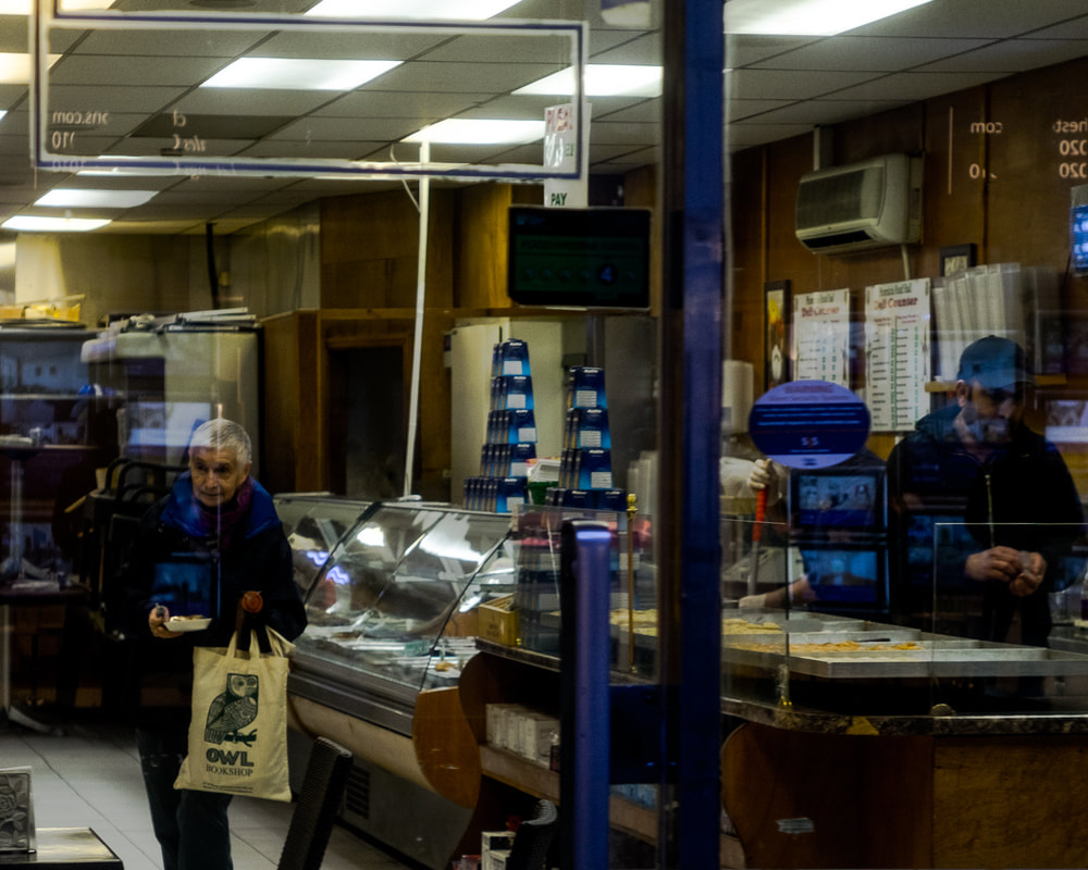
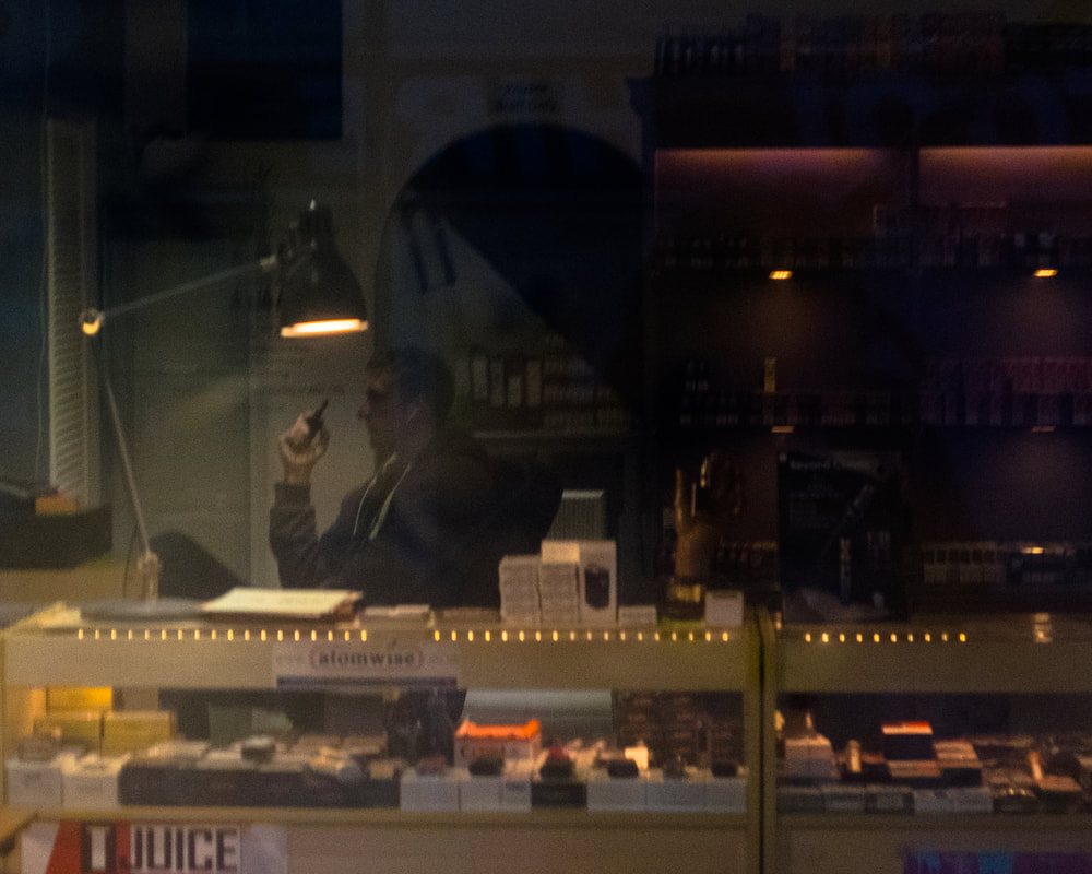
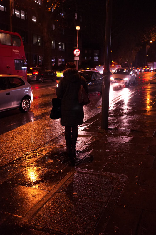
Street Photography (11th dev)
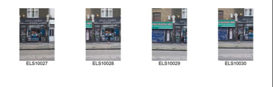
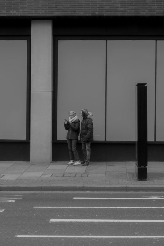
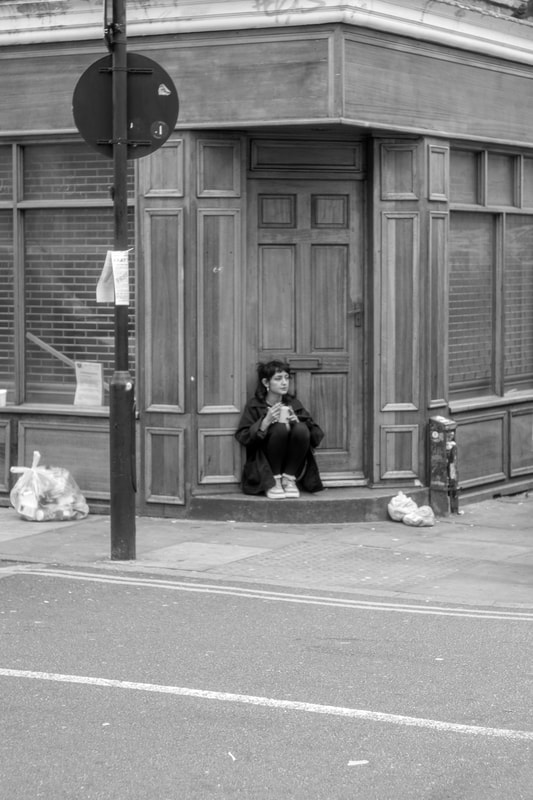
Street photography (12th dev)
|
|
|
|
street photography (13th dev)
|
|
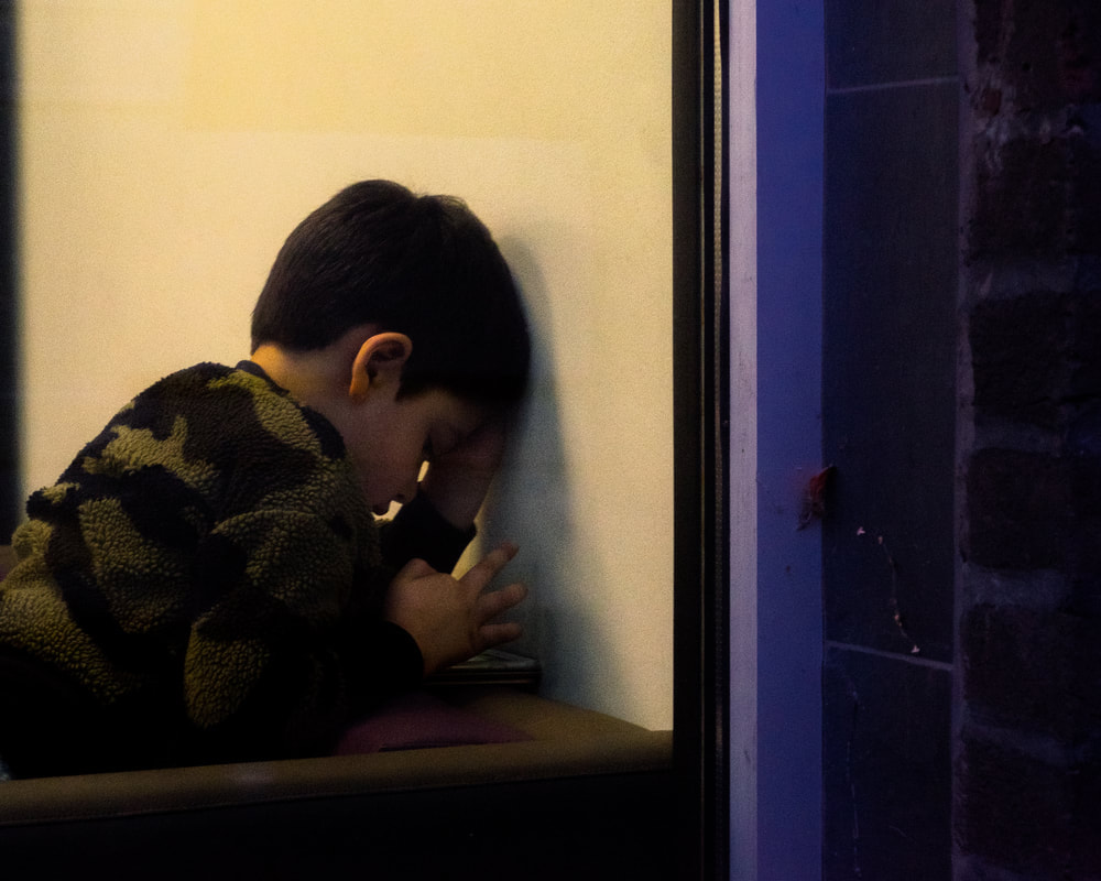
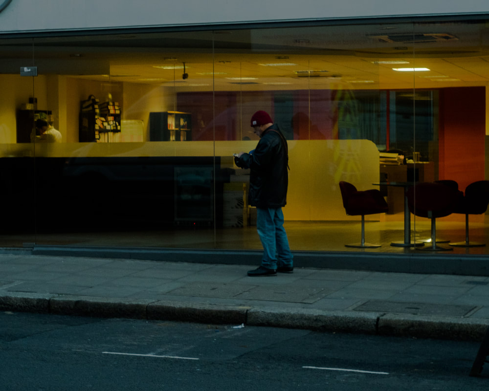
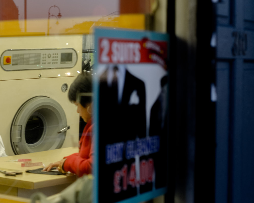
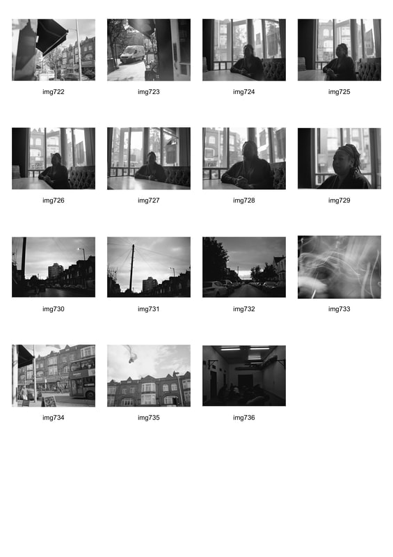
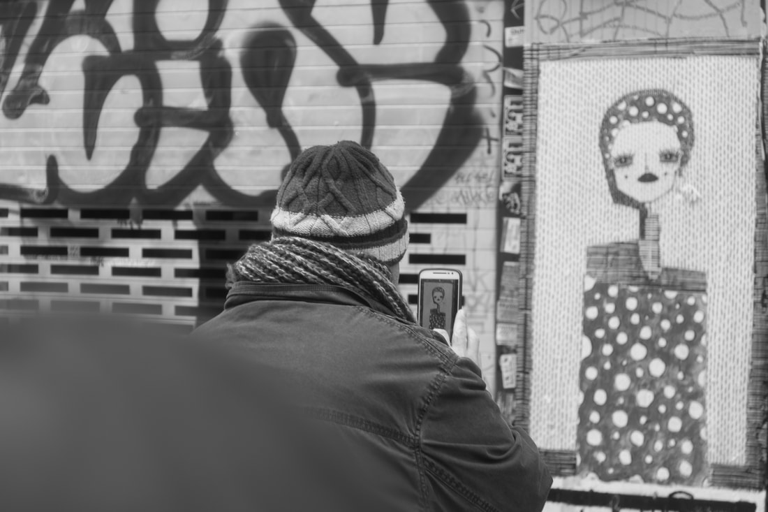
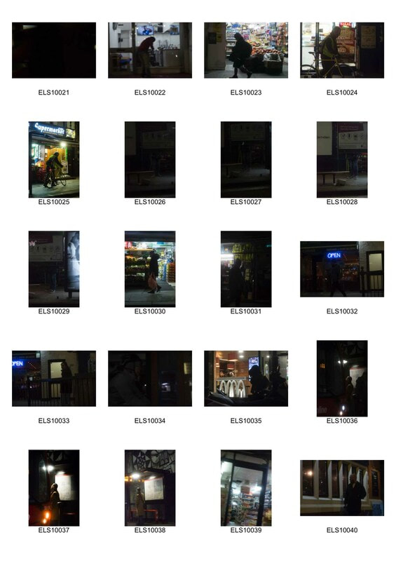
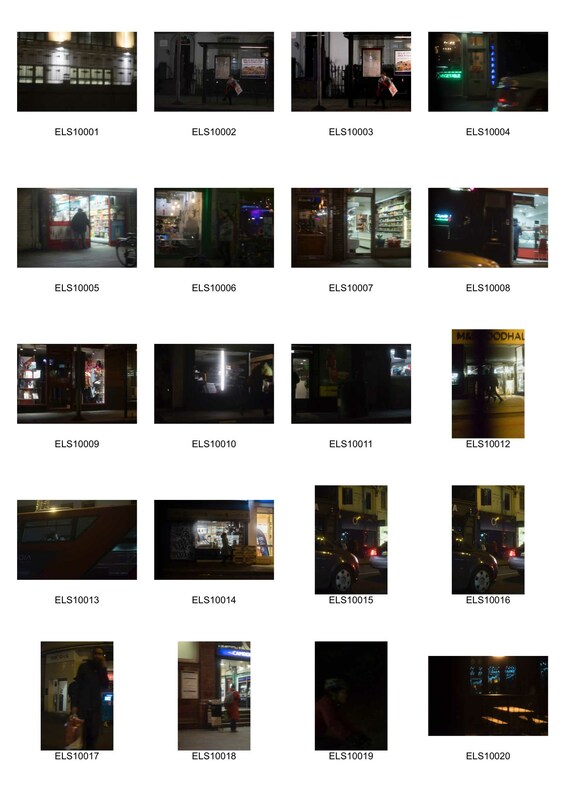
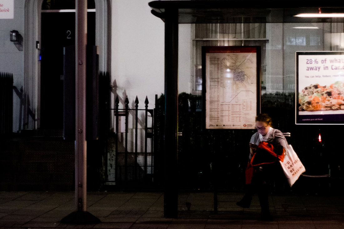
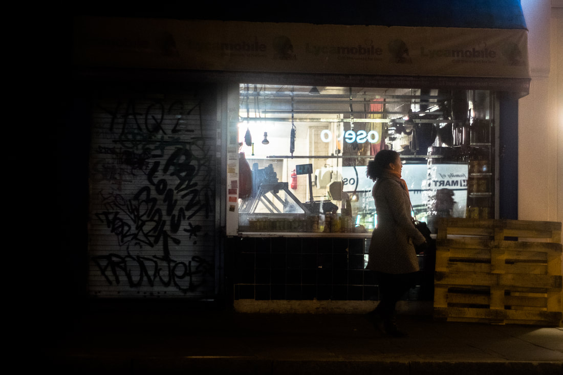
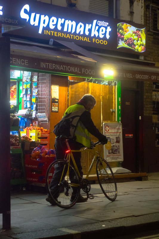
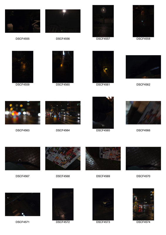
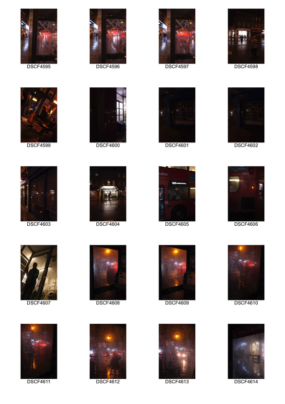
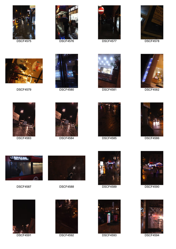
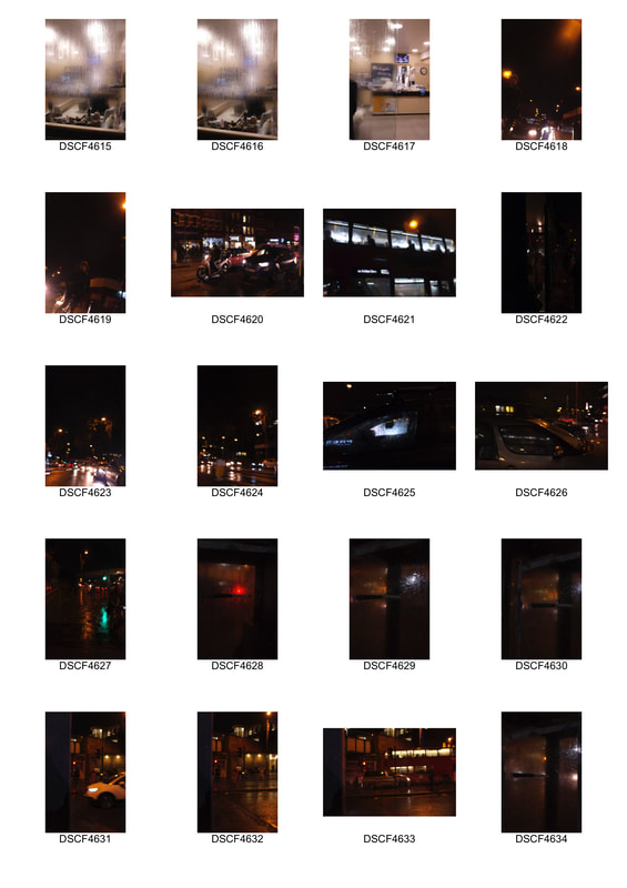
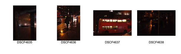
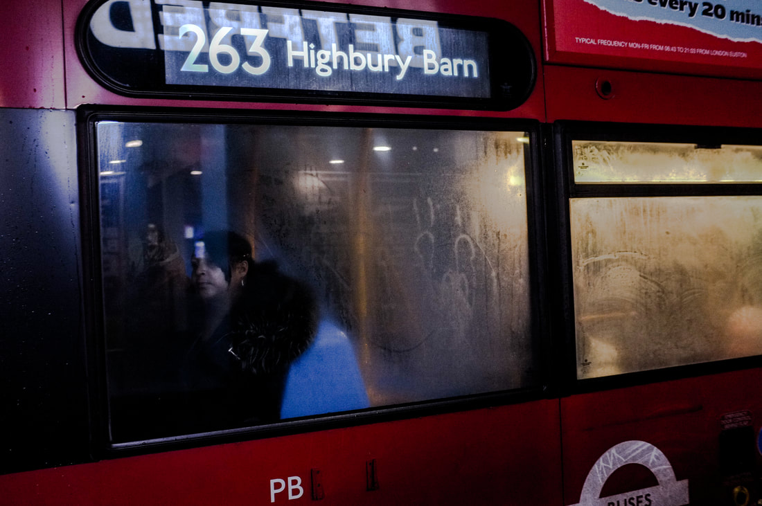
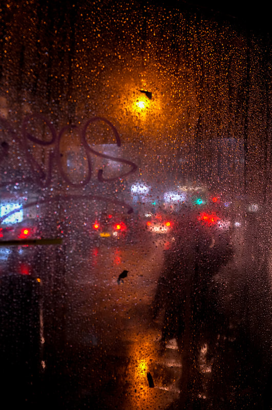
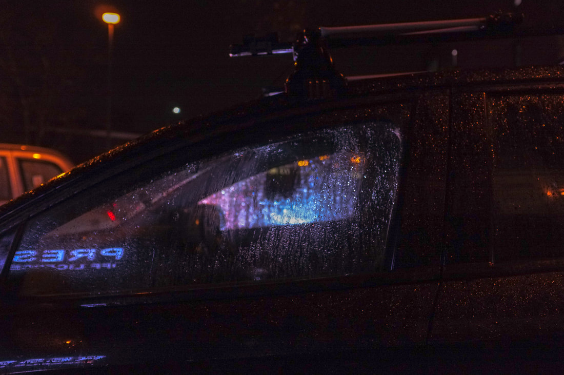
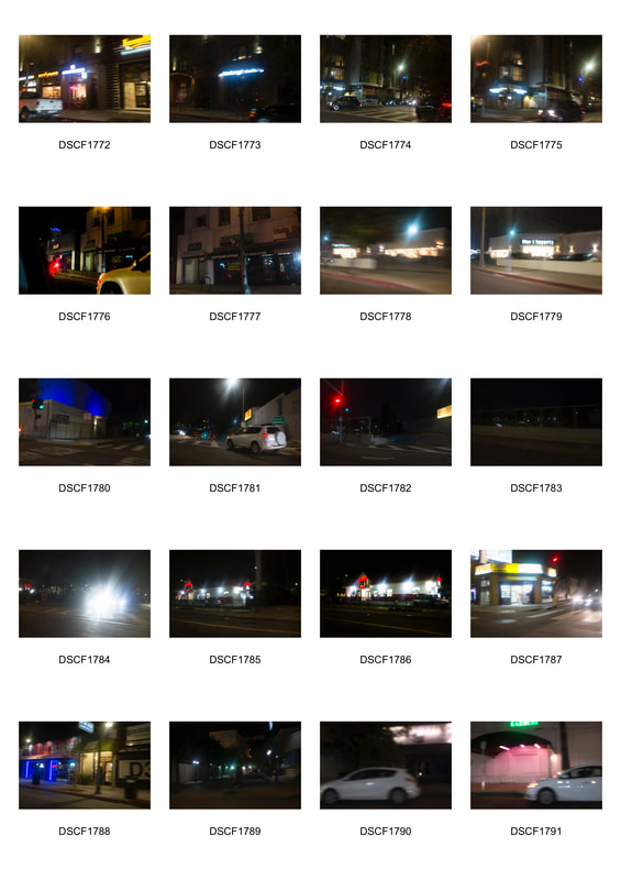
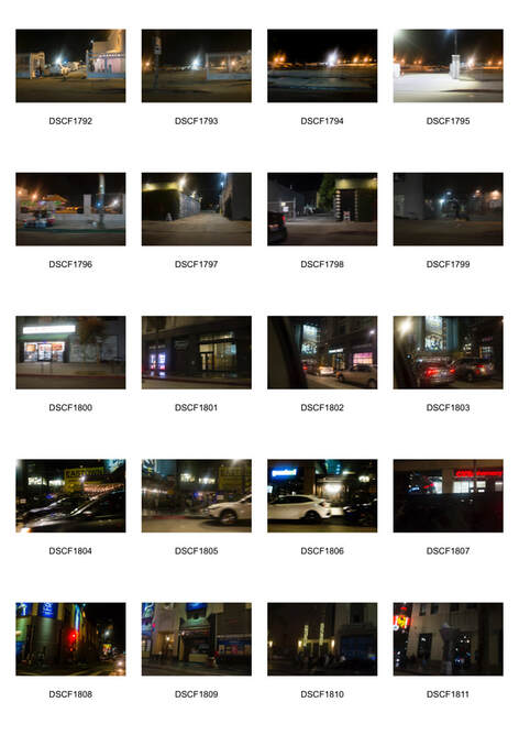
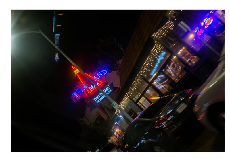
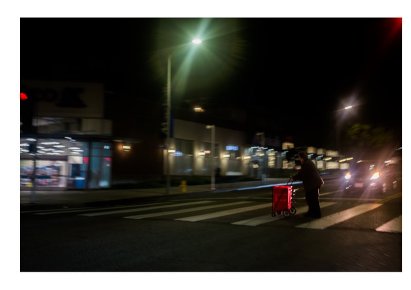
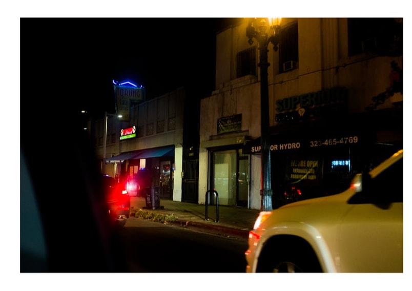
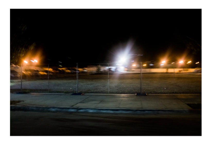
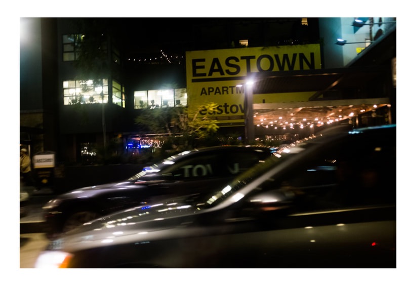
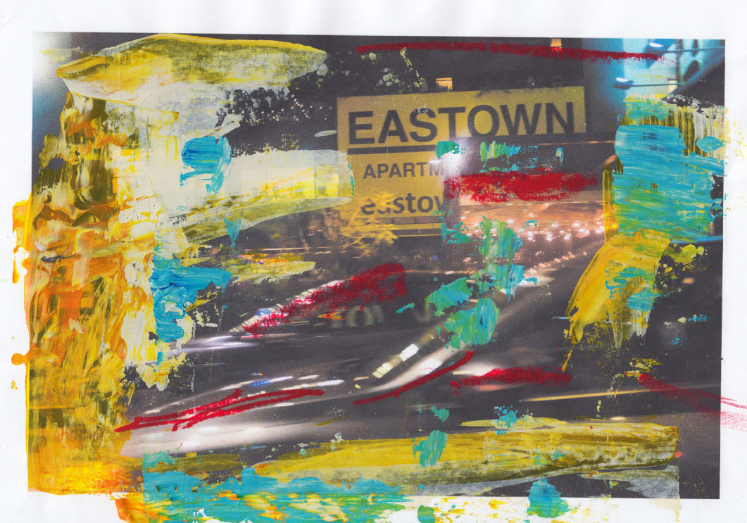
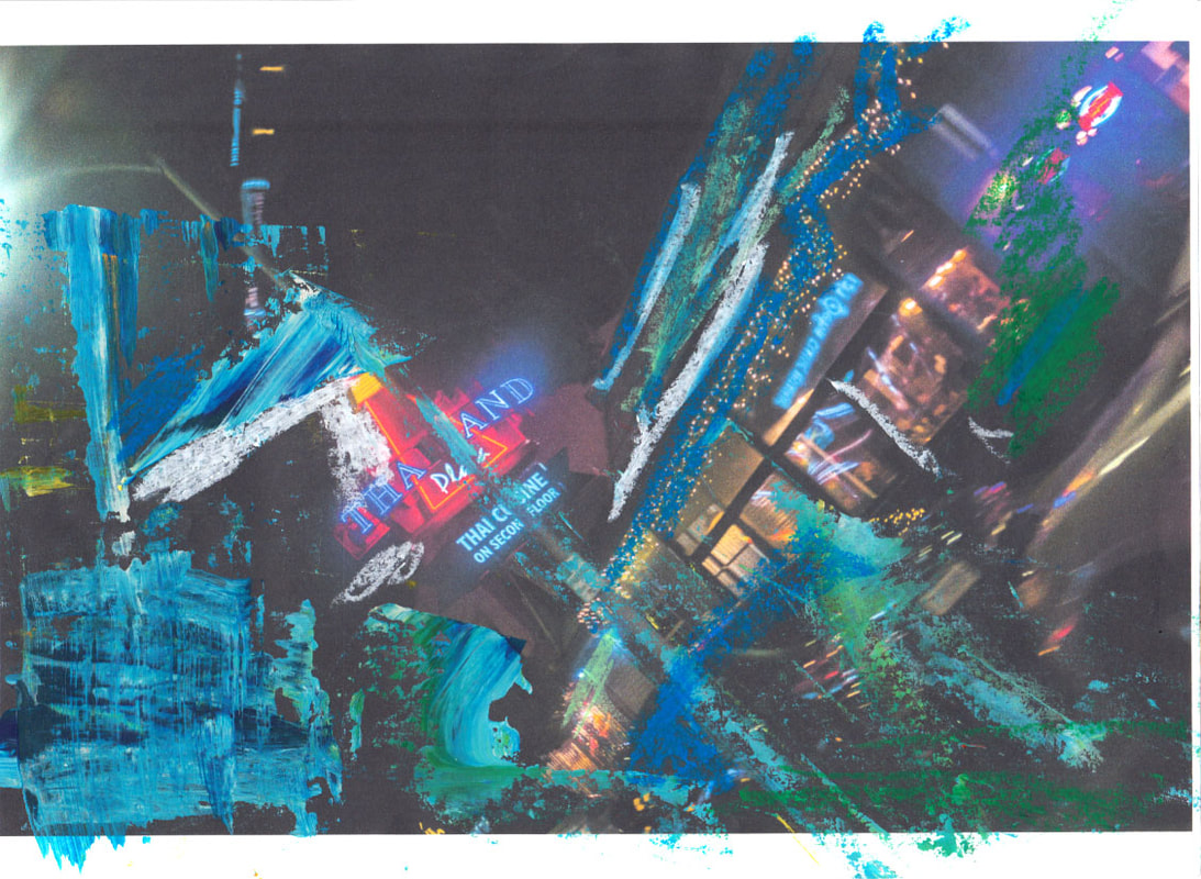
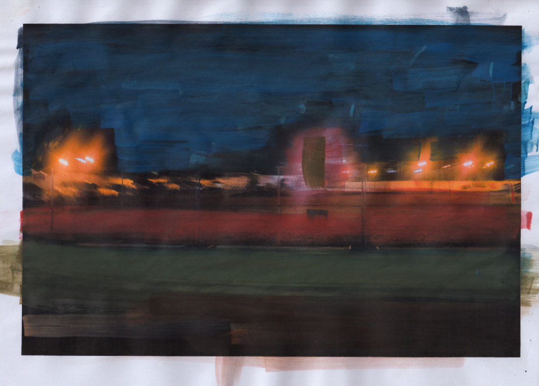
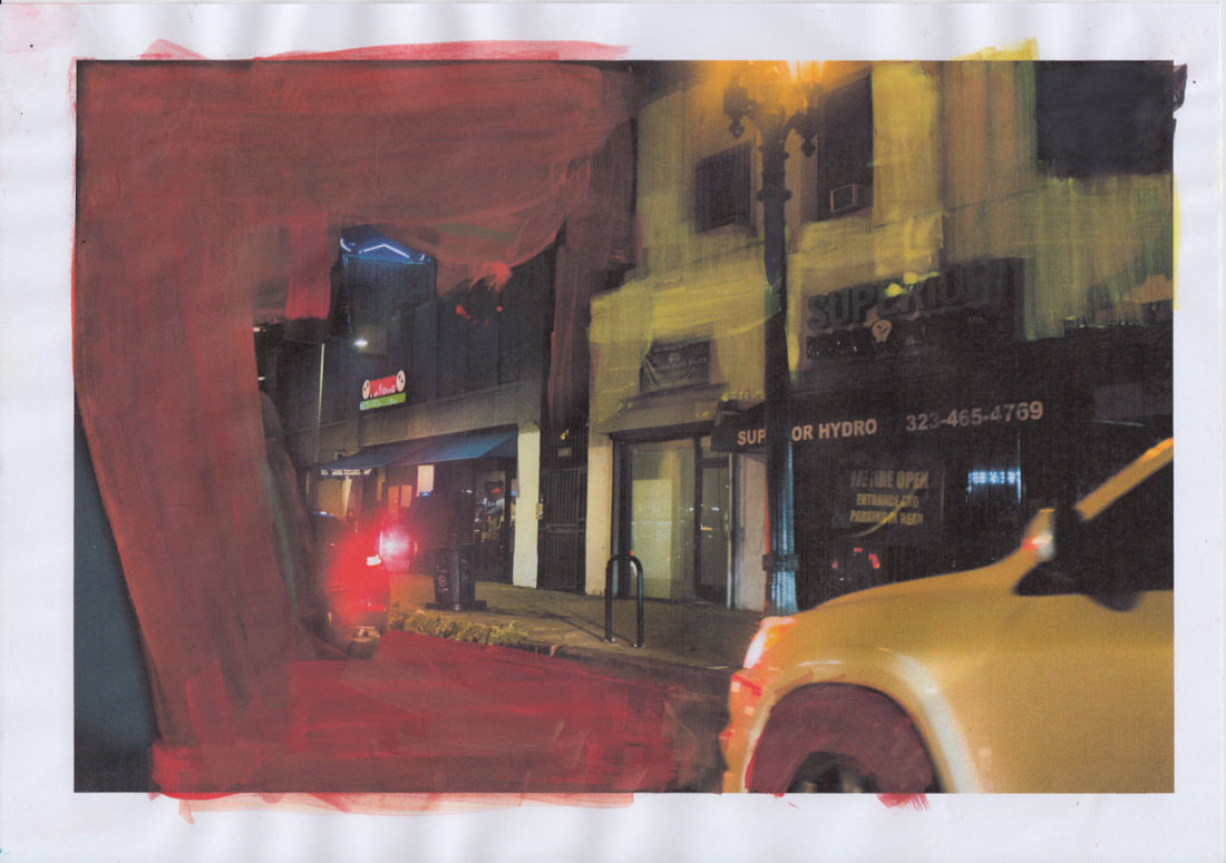
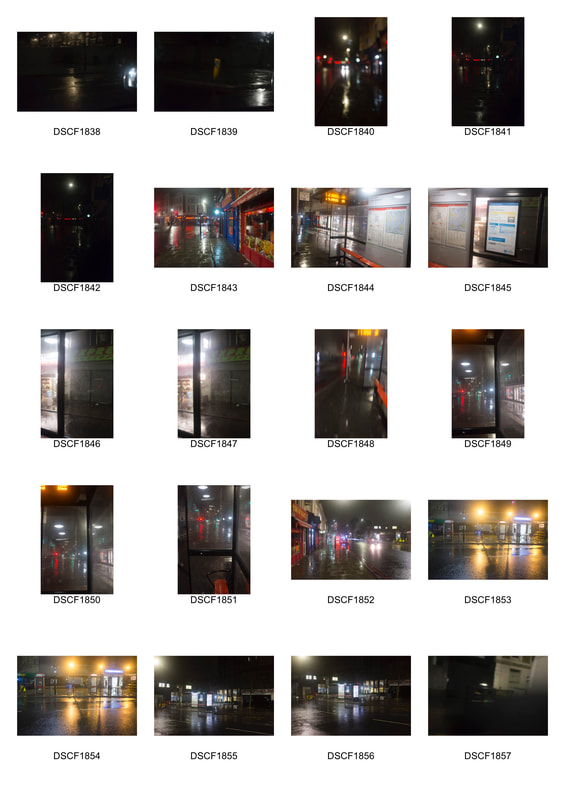
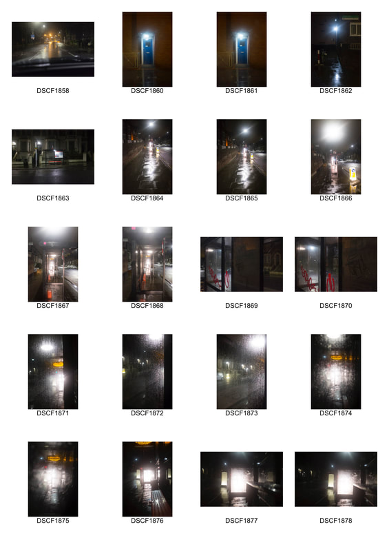
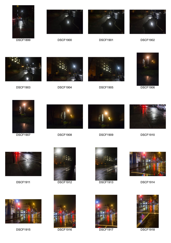
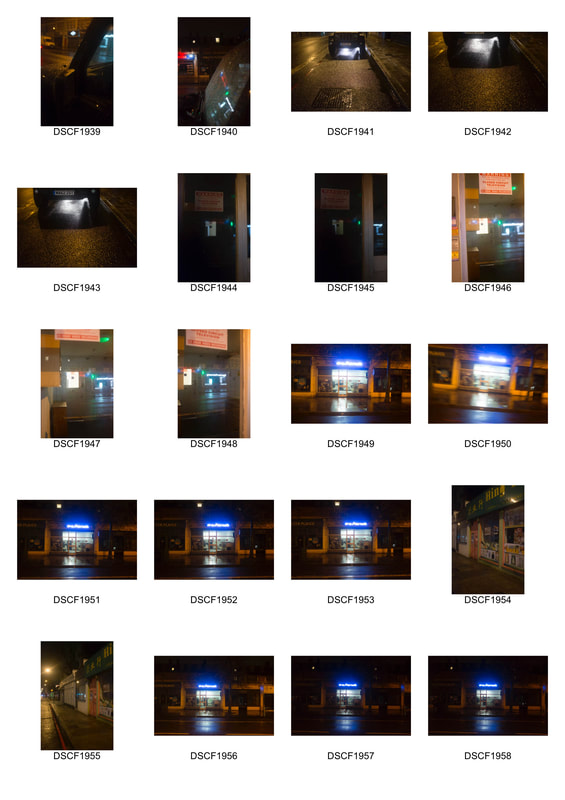
Abstraction & Beauty within the streets (14th dev)
For this shoot I wanted to explore the beauty within street photographs, more particularly at night. Looking at the work of Saul Leiter acts as a main influence for this. I wanted to achieve a textured image with different parts of light being reflected and refracted all around the image. I went out just after it stopped raining so that I could pick up more reflections from the ground but also wold add more textures to any glass windows. It was important I kept an eye out for different windows and bus shelters that would give me interesting light.
|
|
Below I made a few basic corrections in Lightroom. This was to bring out some of the colour and different reflected and refracted light within the image. I also included black and white corrections (same corrections as colour) as I liked the way that it looked with the drips of water and condensation, almost making it look sinister like, which was not as obvious in the colour images. I ended up preferring the colour edits as I thought when I edited the image giving it a bit more saturation it gave the image some subtle but very effective enhancement. When observing these images, I felt they resembled paintings much more than they did photographs. It reminded me of Leiters vibrant work and also his paintings.
Colour Edits...
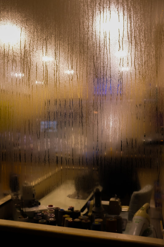
The image above is probably my favourite image of all of these. Although there is no figure, I like the way the water from the condensation falls down from the top of the glass, creating this sinister effect I wanted. The drips ultimately leading to the primary focus of the image at the bottom where you see a sowing machine with various rolls of thread.
Artist links
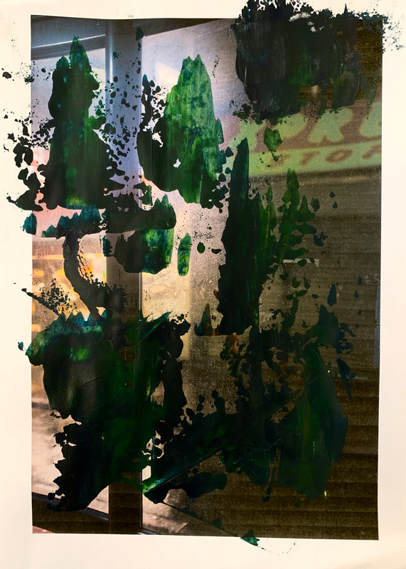
Looking at these images I was reminded of Saul Leiter's paintings over some of his black and white photographs as shown below. Leiter paints over black and white images using Gouache paints. This paint is similar to water colours and allows for Leiter to paint over the image without completely blocking the picture behind. His paintings are a good explanation of his Leiters obsession with colour in his photographs. His use of expired Kodachrome film but also his ability to compose images with colour being the primary focus and aim. His exuberant use of colour in his paintings are most definitely exaggerated, much like the way expired Kodachrome film brings otherwise boring compositions and colours to life. It is interesting the way leiter chooses to photograph in black and white and then proceed to use colour, filling in parts of the image. This represents how the care and control he wanted in his images. Something that would be hard to achieve in his colour street photography as he would not have the control he desired in the field of colour.
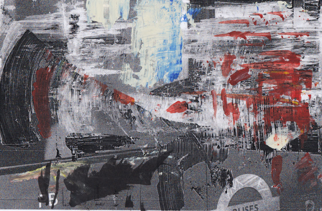
I also looked into painter; Gerhard Richter's own practice of painting over photographs. In the same style he paints his massive abstract paintings he drags an array of different coloured, thick, rich oil paint over the images to create this fluid motion of paint across the photographs, abstracting and weaving into the photograph. He carefully chooses each colour, drawing influence from the colours that the photograph possess. During the 1980s Richter first started to make overpainted photographs. At this time, Photography was becoming a more popular medium and was becoming more widely used in art. An important discussion at this time involved questioning the emotional aspects and qualities of the painting as a medium. Richters works over photographs was his integration of the two mediums. Perhaps Richter was questioning the ideas of photography and their position in fine art at that time. Photography was becoming more democratised and many more people had access to this medium. Richter uses these ,almost everyday photographs and turns them into a more respected piece of literal art. He perhaps thought photography in itself did not exist as 'art'. These photographs either represent his integration of the two or perhaps rejection of the fact photos could be considered 'art'.
Both Richter and Leiter's works on photographs are extremely colourful examinations of photographs. Leiter brings his own unique palette to photographs that do not possess the slightest bit of colour while Richter cleverly chooses his colour relating to the photograph but also in other works it is clear he thinks carefully before adding various colours that aren't contextually informed by the photograph. Both artists share that similarity in having a very considered approach to their work. The overpainted photographs almost acting as practices and studies to help them eventually suffuse this knowledge into their paintings or in Leiter's case his photographs. Their use of mediums are also very different. Richters use of oils allow him to cover the photographs in a very direct and punctuated way that still leaves areas revealed. Above you can see how the application of paint varies in texture and shape in every one of his images. This is different to Leiter as his use of Gouache remains consistent in it application. Texturally speaking it leaves a chalkier texture to the image.
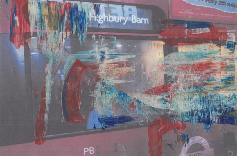
Both these effects are something I want to experiment with after I shoot my next set of images. I think at night will be the most successful as there are a lot more sources of light that create interesting effects in the glass and also contributes to the condensation in buses that create a nice effects. Although figures within the images may be more interesting, the reflection and refraction is more important so that I can be informed as to which colours and effects to use when painting over the image. I began with using the images from my last shoot (above) . My aim of this was to try and let the colour of the images dictate the choice of paint colour.
Over painted photographs first response (paintings)
|
Before adjustment
|
After adjustments
|
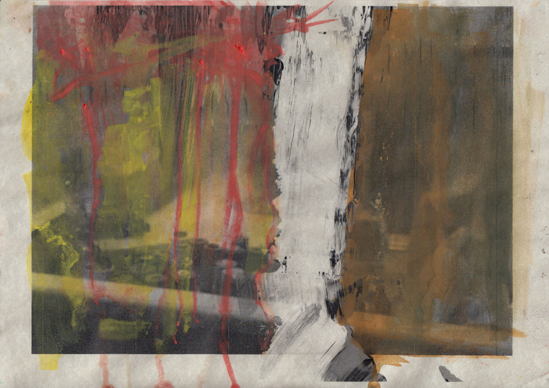
The image below shows the first one I did which was highly unsuccessful. The colour choice of was a mixture of odd colours that did quite fit the image, furthermore I kept covering the image, stopping it from being seen and the application was thin and covered a huge amount of the image.
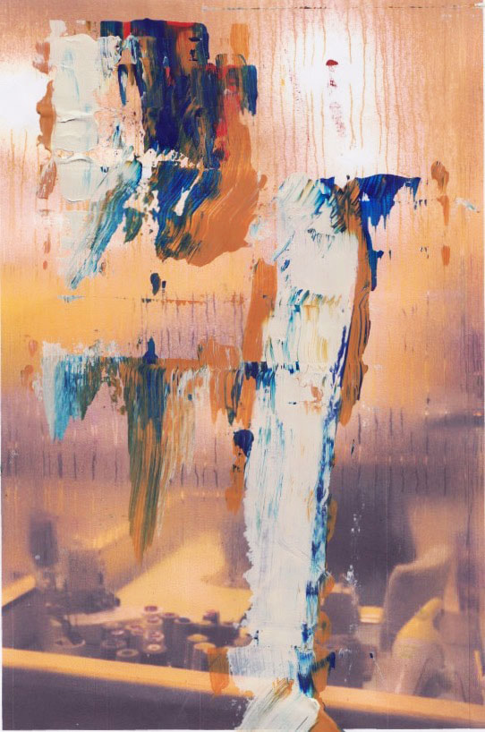
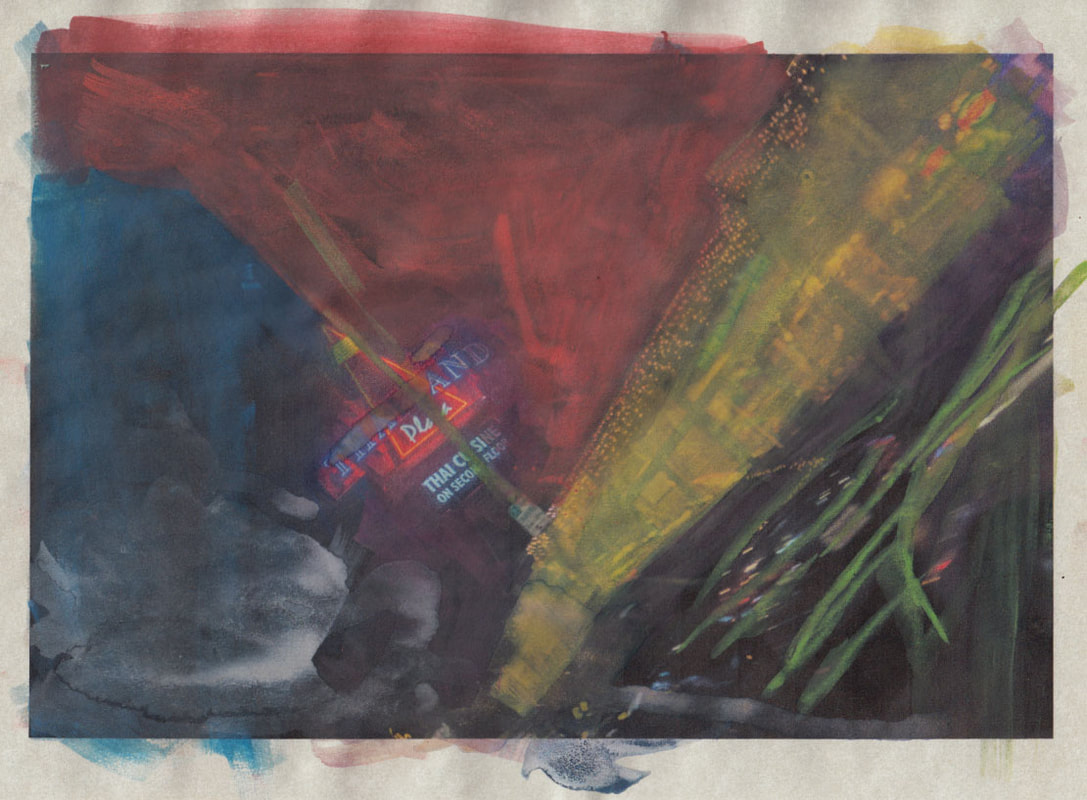
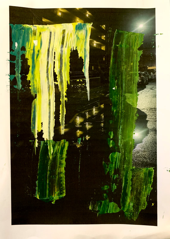
As I was using acrylic paint, I could not quite achieve the same effect as Richter does. Having said this, this results in a slightly more unique paint application. I used a piece of wood with a flat edge to scrape the paint across the images. This created a more broken up effect in the strokes but also the less opaque acrylic paint allowed for parts of the image to come through, almost as if there was a clear coloured filter on the image. My most successful one I think is the second one. I think the strength of the image gave me a lot of room to integrate the paint seamlessly into the image. I chose the colours with more exaggeration (much like leiters choice). However this exaggeration was still very relevant to the image. I feel this work drifted more towards Richter style however draws some inspiration from Leiters works in reguards to the exaggerated colour.
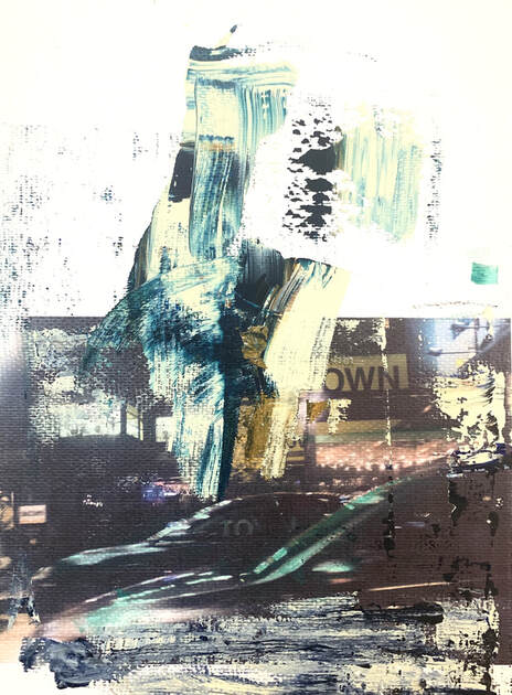
re works- (15th Development)
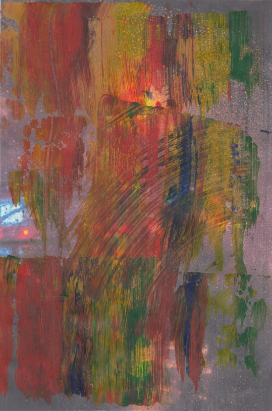
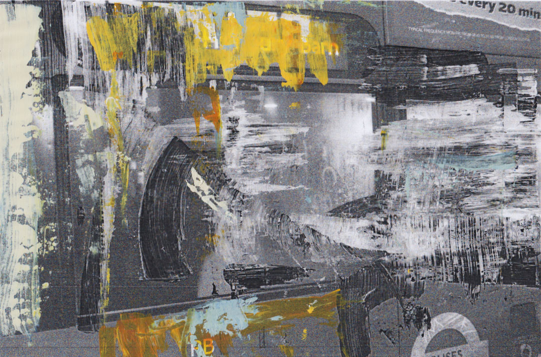
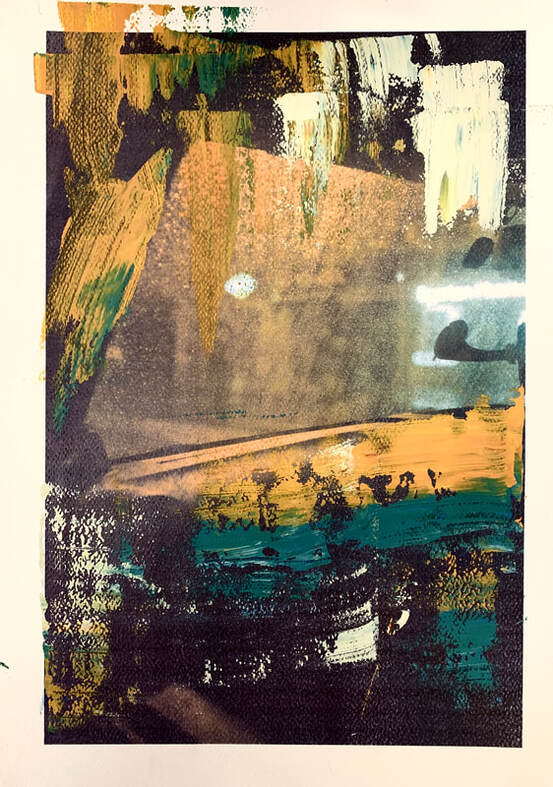
For the Reworks, I photocopied the images I had already painted over. I did this on several different textured papers. E.g water colour paper. I did some in black and white which created a nice texture to the image when photocopied, making the paint look almost three dimensional. I then added some more bits of colour, trying to abstract the image by adding many layers. I thought this was fairly successful however it becomes very easy to over abstract the image. During the photocopying process some errors ocurred, turning some of the images into a slightly warmer and more red image. This result ended up working in my favour as it allowed me too
As you can see above, the watercolour paper I used has a thick rough texture that allows for interesting textures and also gives the image a certain amount of depth. The first image below shows my first experiment with watercolour paper.
Overpainted photographs (16th development)
|
|
painted versions
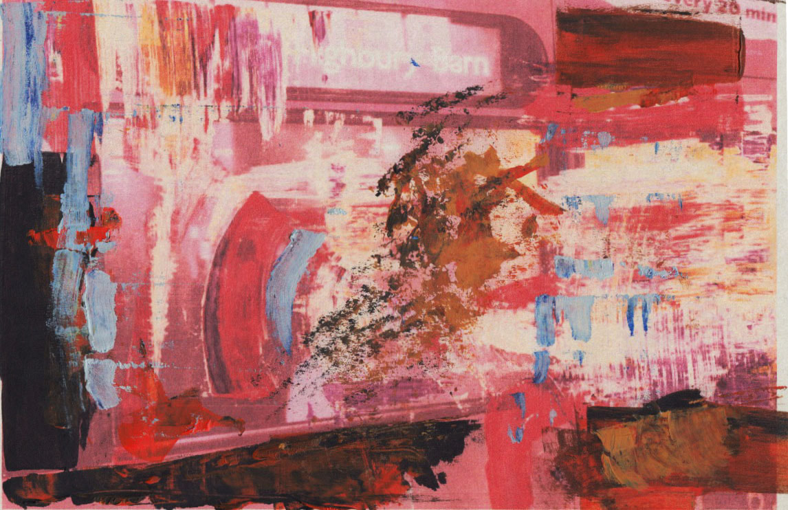
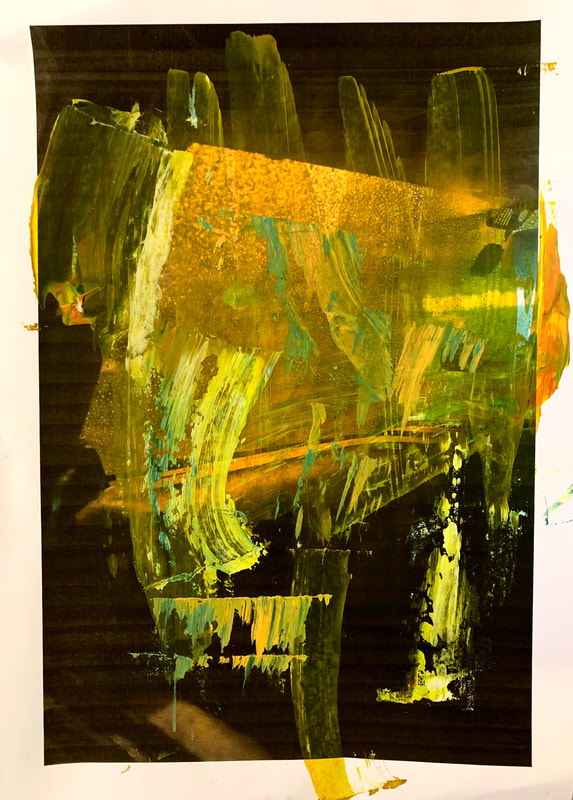
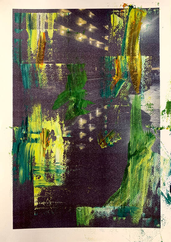
For this group of paintings I tried to make sure that more of the image was visible through the layers of paint. I also experimented with using Oil pastels. I drew over using the side of the pastel to create a more broken, translucent effect in order to keep the image visible. On the second painting I feel this was more successful with the green pastel as it seamlessly blends with the variety of strokes of paint.
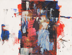
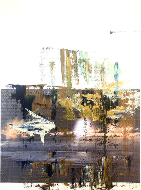
FINAL outcomes...
|
|
For my final mock exam outcomes I wanted to use watercolour paper as I though it was the most successful texture that I have used so far. I also used acrylic paint for this instead of watercolour as I wanted the paint to sit very directly on the image while also being slightly translucent. I feel this is my best exploration of the overpainted photograph technique yet. I chose to print the images on one side of the paper, allowing me to explore the emptiness of the rest of the page. This rises interesting questions to me of whether this is a photograph or a painting. The medium of paint feels more real and allows colour to be represented in a true form. With digital cameras being extremely popular with more people these days, we often forget the art of painting and what documenting was before painting. I feel my overpainted photographs are subtle in their integration. The form of the entire photograph is not lost however various parts of the image feel like they are bleeding into the boarder because of this paint. In some ways this questions the quality of the image without the paint. Leaving these images with no paint would not be a complete photograph. The exaggeration of colour feels more truthful to life than the image. My intentions of bringing out the best parts of the image were achieved in this and not only this but I achieved an overall composition that is right in the middle of being a painting and a photograph. The only thing I would have done differently is do it on a slightly bigger scale to achieve this sense of an actual painting and I would also take more time taking the right images. I feel the images with more existing texture from things like rain would allow a deeper exploration with paint and all together would produce a more interesting image.
Ian Mckeever
Ian McKeever uses a similar technique to paint over images than Leiter does, both of them using gouache to paint over black and white images. However, McKeevers work is still slightly different. He primarily paints over contrasty black and white landscapes and abstracts them even further than Leiter does, resulting in paintings more than photographs. His choice of colour is also a huge difference, using mainly blues and greys, restricted to one tone, whereas Leiter prefers to use more vibrant, primary colours, leaving the images in a position that is both very photographic yet in a recognisable form of a painting.
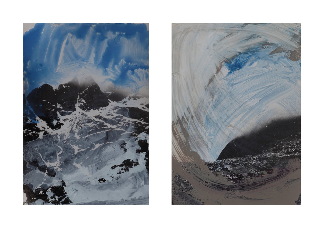
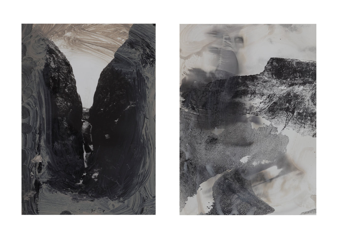
Although McKeevers work isn't the exact direction I want to take my overpainted photographs, I am still interested in the way he applies the paint. In these images, you can clearly see which marks are more or less diluted with water. The marks that appear more textured and less opaque appear as dry marks that resist nicely to the perhaps glossy photographic paper. He applies the pant with quite a lot of freedom and in a way that leaves important part sof the images still visible to the viewer. His choice of colour still feels relevant to the image, leaving parts of the sky blue and the mountains a more grey feel, however his use of black and white somewhat limits his choice of colour.
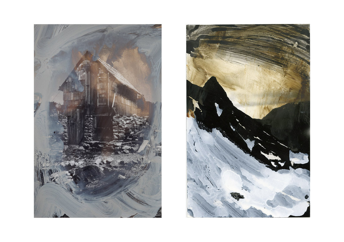
my response to Leiter+Mckeever (17th Development)
For my painted photographs, unlike Leiter, I wanted the choice of colour to draw relevance from the actual image being presented. Leiter's colour palette would be well suited to this however I did not want to photograph in Black and White as it is an important factor in choosing the colours wisely. I still used various other prints I had gathered which included black and white photocopies of my previous overpainted photographs. This allowed interesting textures to come through giving me some freedom to experiment with adding colour. This is demonstrated in the final painting.
In the image above I feel there was a mixed amount of success in this image. In particular the bottom left corner shows an interesting application of paint very similar to the way McKeever applies his greys and whites, diluting with water and almost placing droplets on the paper to react with it, creating it's own mark. This mixed with the colours similar to leiter and also the more narrow and expressive marks on the bottom right corner. I feel this image was a success.
The image above is probably my favourite images out of this series. I feel that these watercolours are a good practice for the more refined and rich acrylic paintings. I
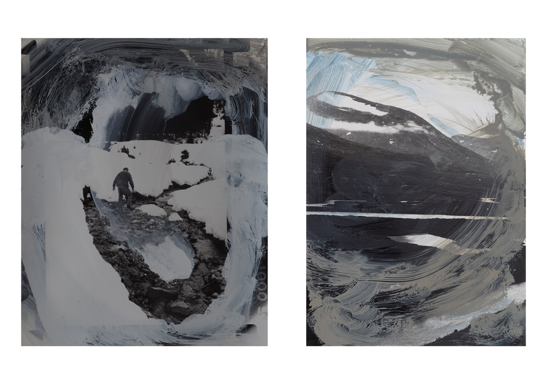
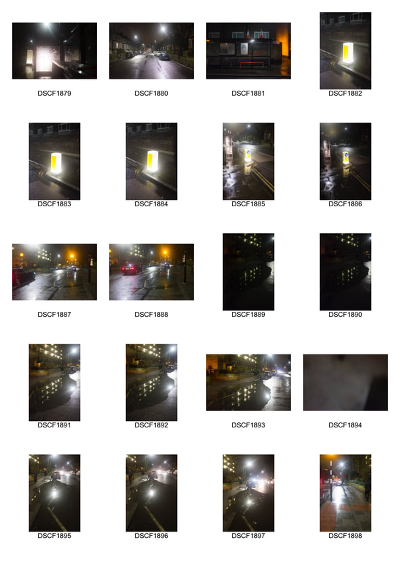
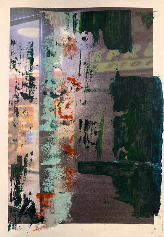
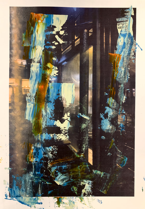
overpainted photograhs (18th Development)
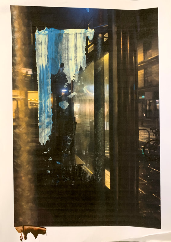
Before shooting it was important I knew exactly what to look for. I liked the way in which the rain effected the images in the first shoot so my priority was to go out when it was raining. I then thought about the time of day and how it effects it. I felt it would be interesting to see how the images turned out if no one was in the image. At this point in my work I was raising questions about urban landscapes and the way light falls on these landscapes, exploring the nature of colour and light in urban living. Therefore I chose to potograph early morning time so that there were less people around and it was still dark.

|
|
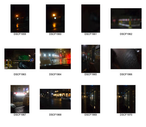
Overall, I felt these images were probably my most successful yet. I felt that I was able to capture light in a very interesting and exaggerated way that would give me a lot more options for me to paint over. The rain was a huge help in achieving this effect and otherwise wouldn't have had the same effect. Both the image and the physical print becomes distorted
|
|

Artist and ME

A (Gerhard Richter)
B (Me)
I was overall very happy the way my Final pieces turned out.
