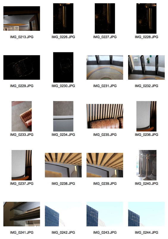
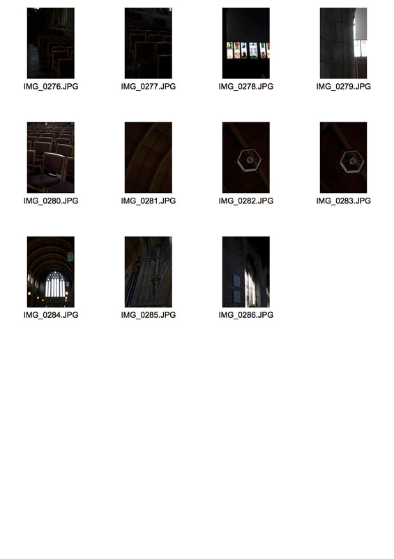
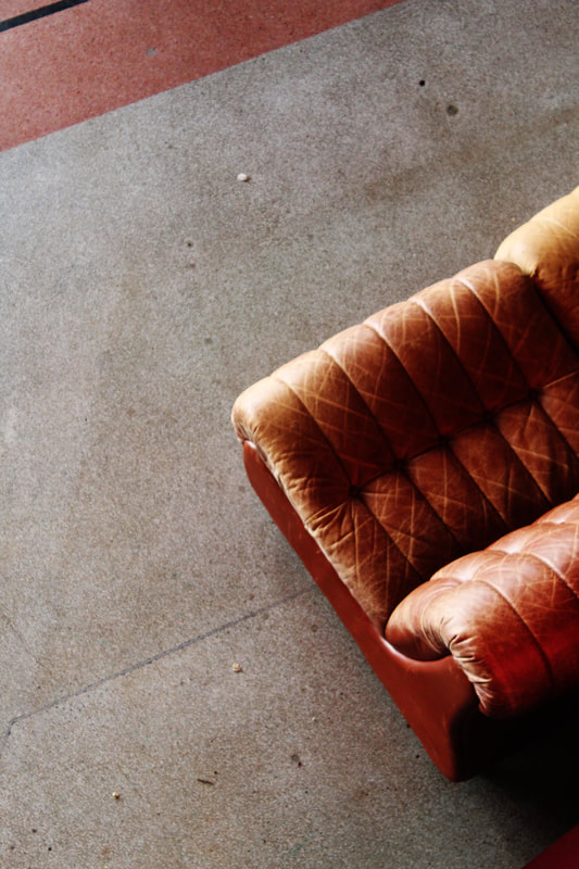
architecture : Everyman cinema
|
|
|
edits : Everyman cinema
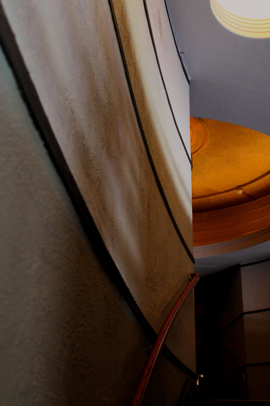
For the image above I wanted to create an even line of symmetry however there was an object in the way of this being evenly symmetrical. Firstly I tried to use the spot removal tool (or clone stamp) to remove the fire alarm from the image. This was hard to achieve as it was a large space to cover including the shadow. Because of the almost perfect symmetry of the subject I decided to mirror the left side of the ceiling and over the right side of the wall so it appears the same. This was simply done by selecting half the image and mirroring it and placing it on the other side
|
|
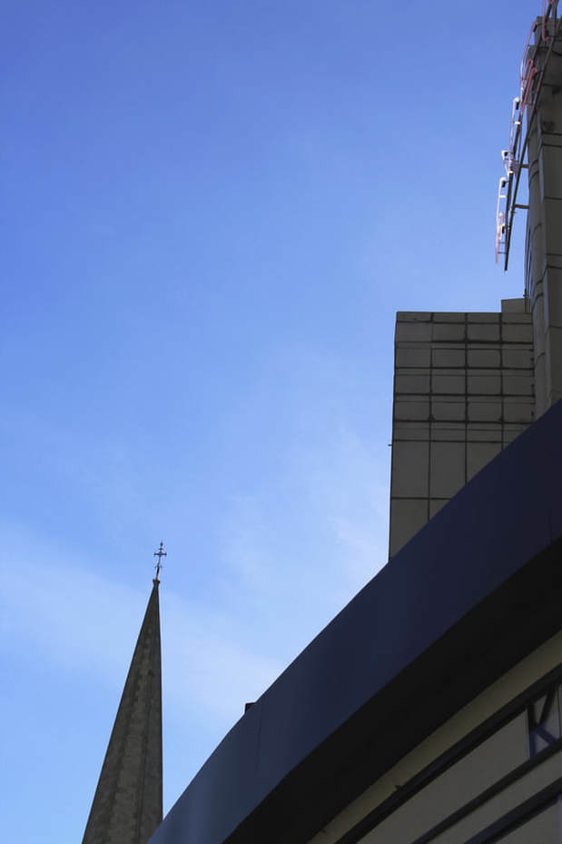
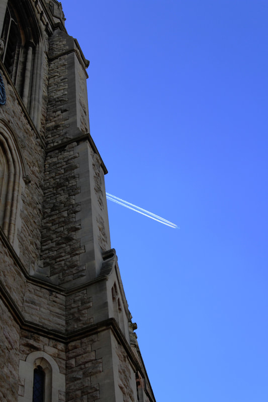
I think the image above on the left is quite strong as it has a good use of negative space from the blue sky however it is quite nicely broken up by the spire of the church and also the curved front of the cinema with the sign and the rest of the building
|
|
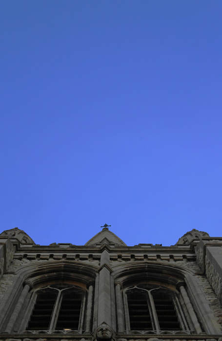
edits : st james' church
|
|
|
|
|
|
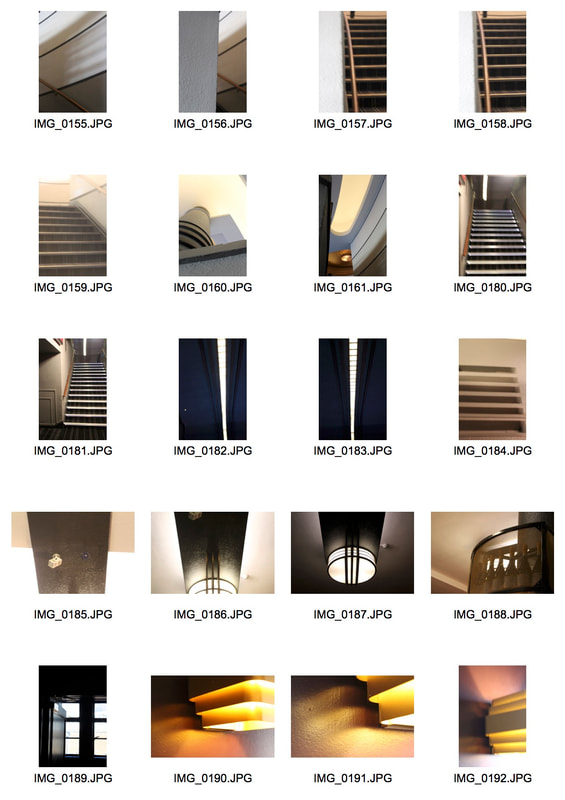
studio task
|
|
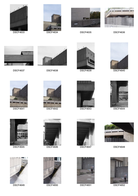
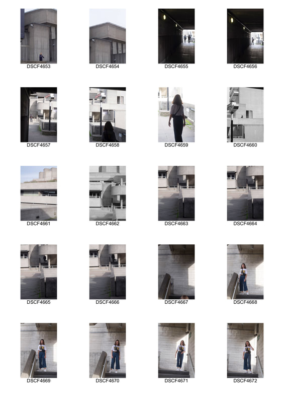
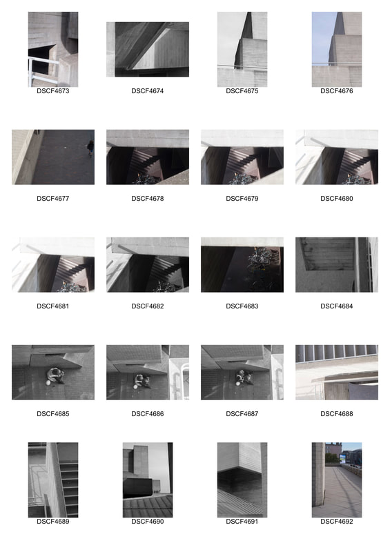
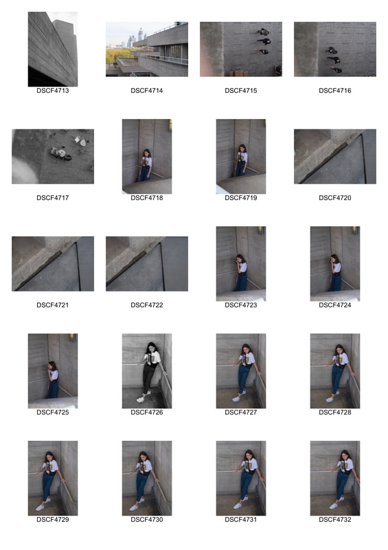
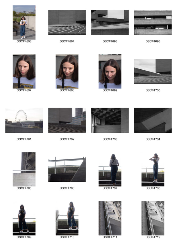
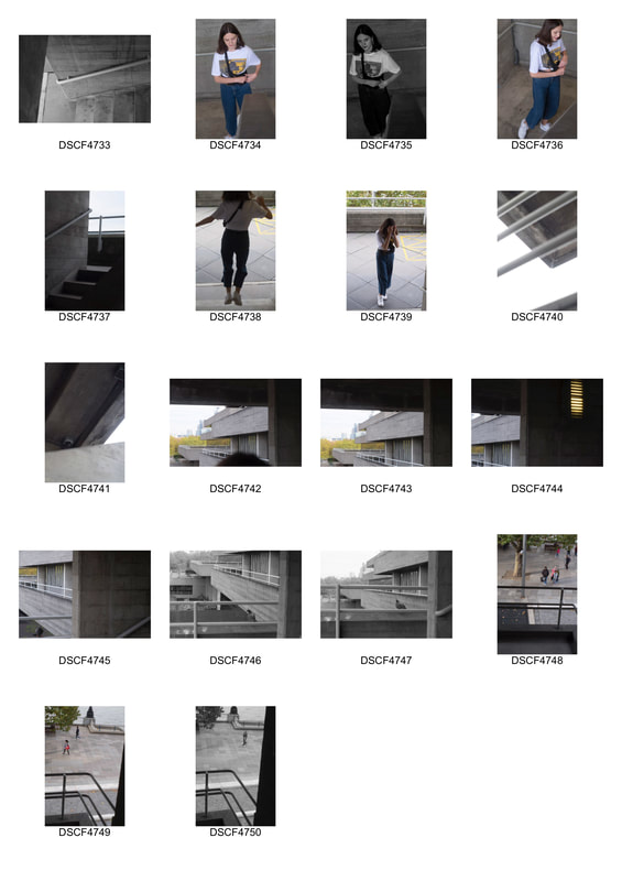
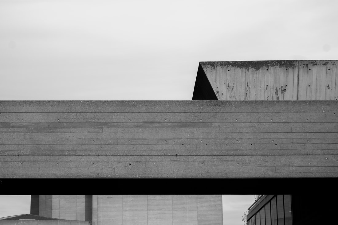
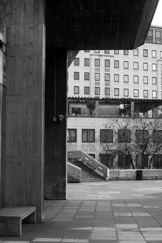
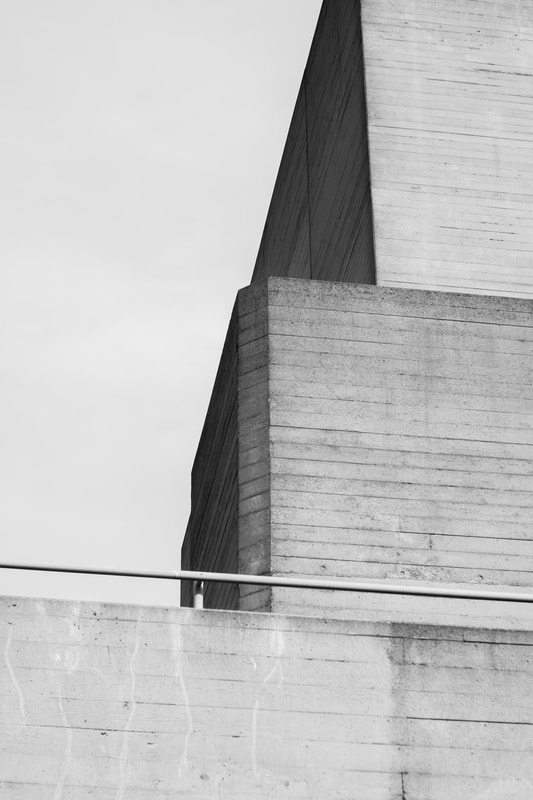
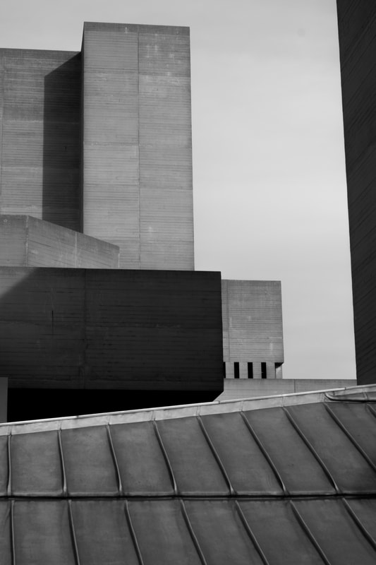
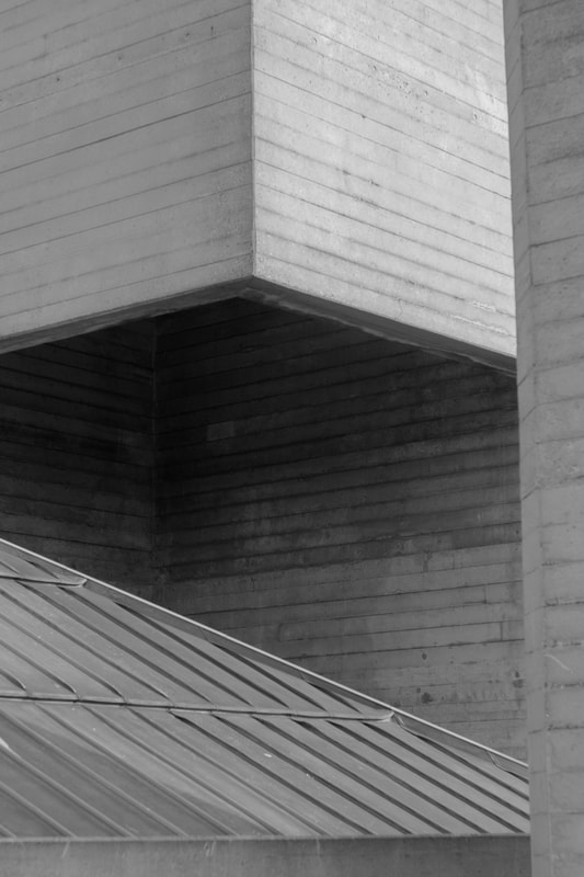
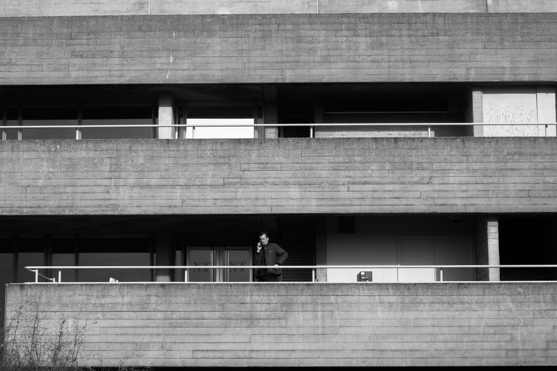
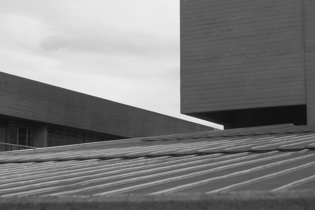
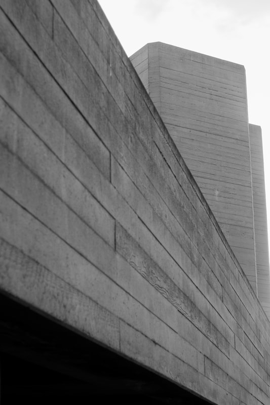
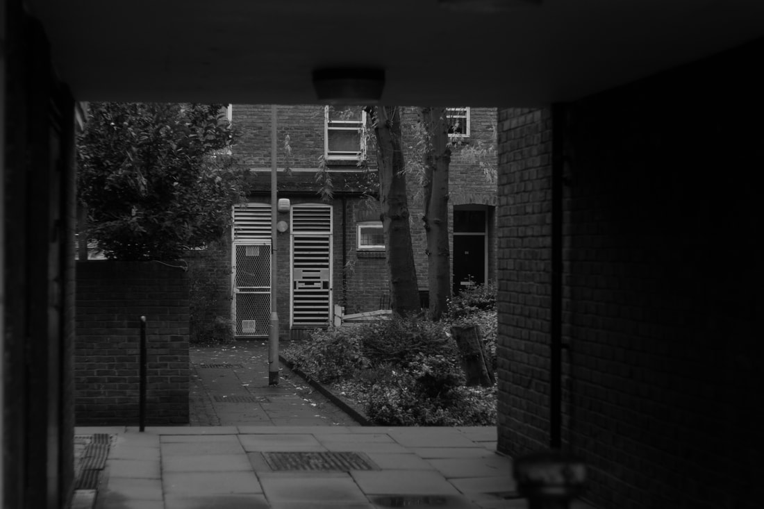
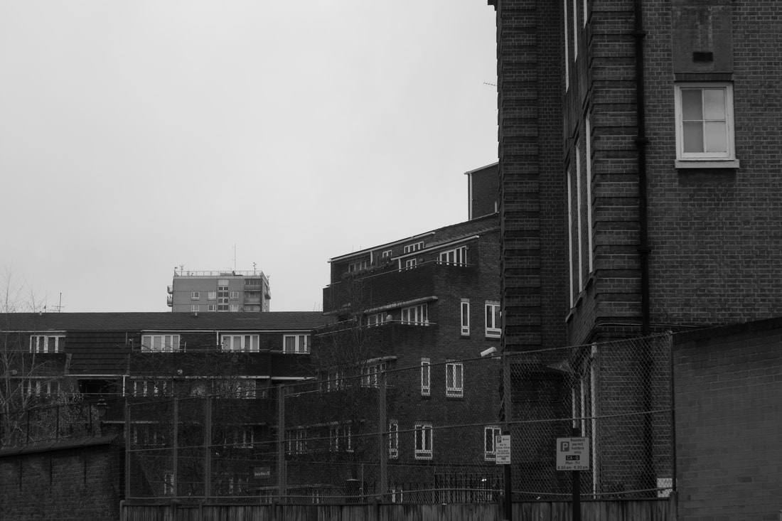
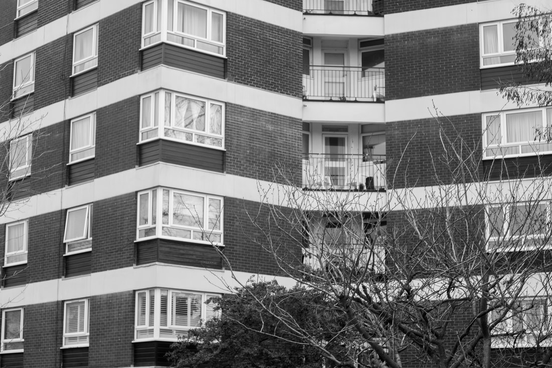
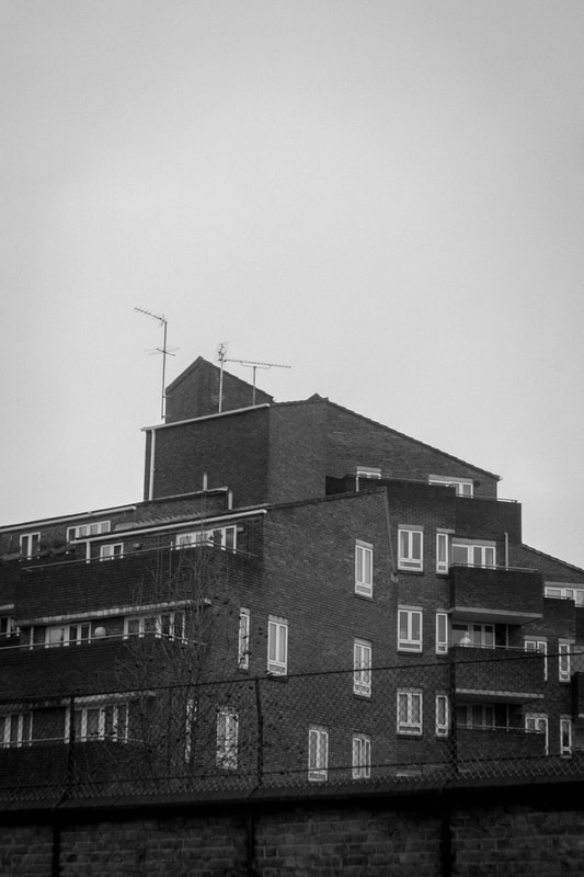
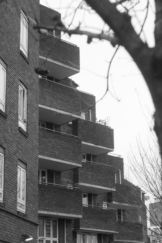
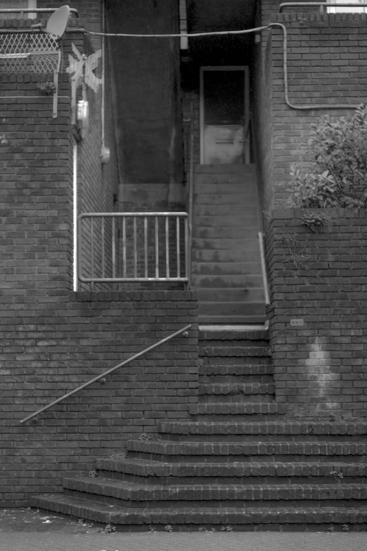
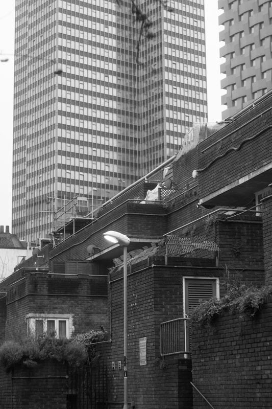
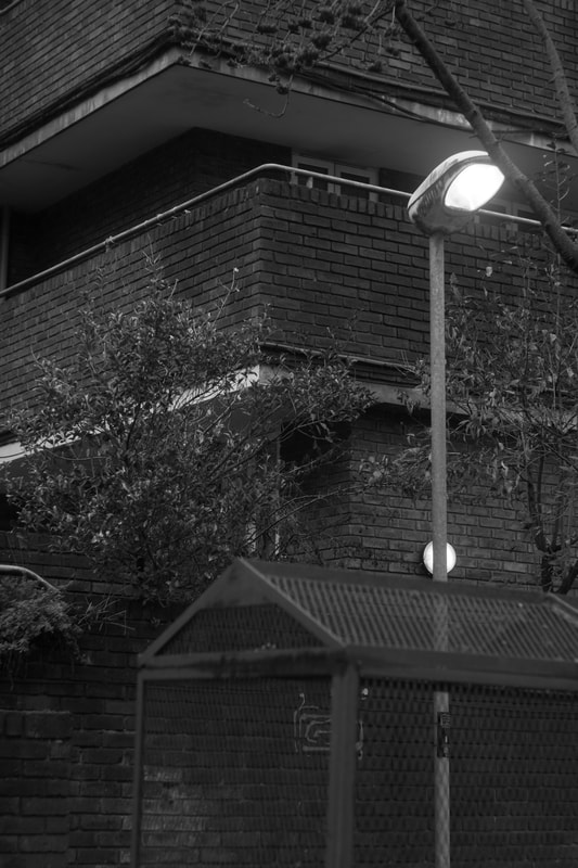
half term brutalist task
|
|
|
|
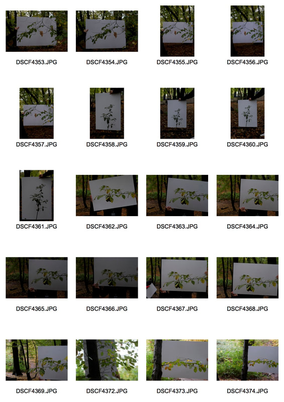
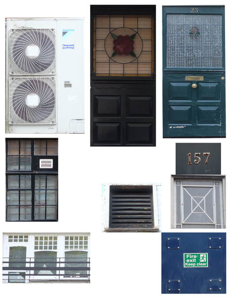
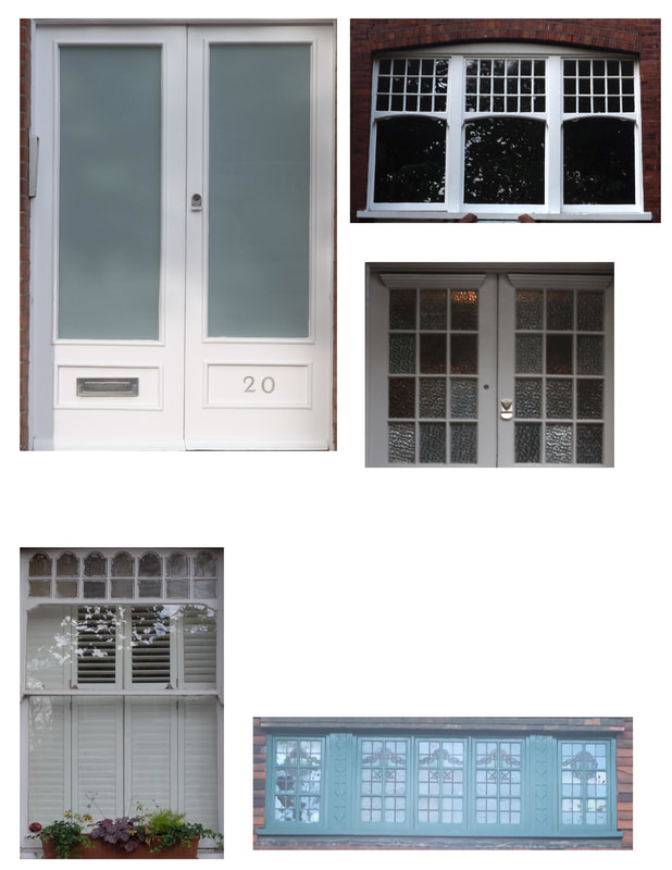
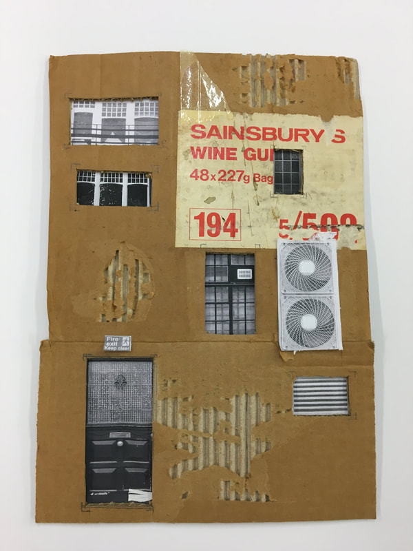
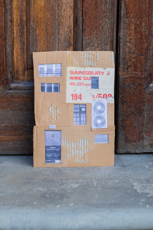
cardboard task
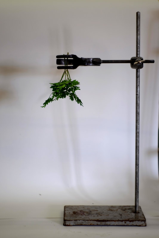
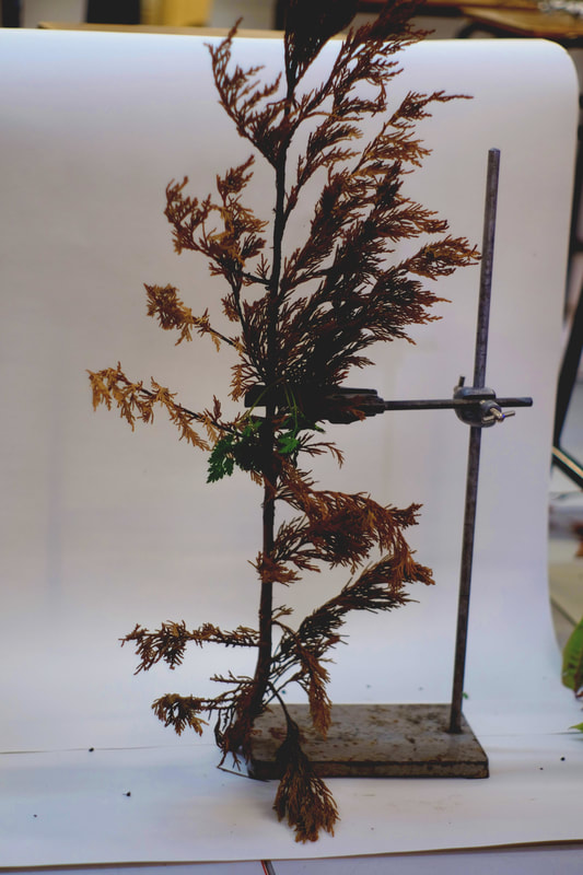
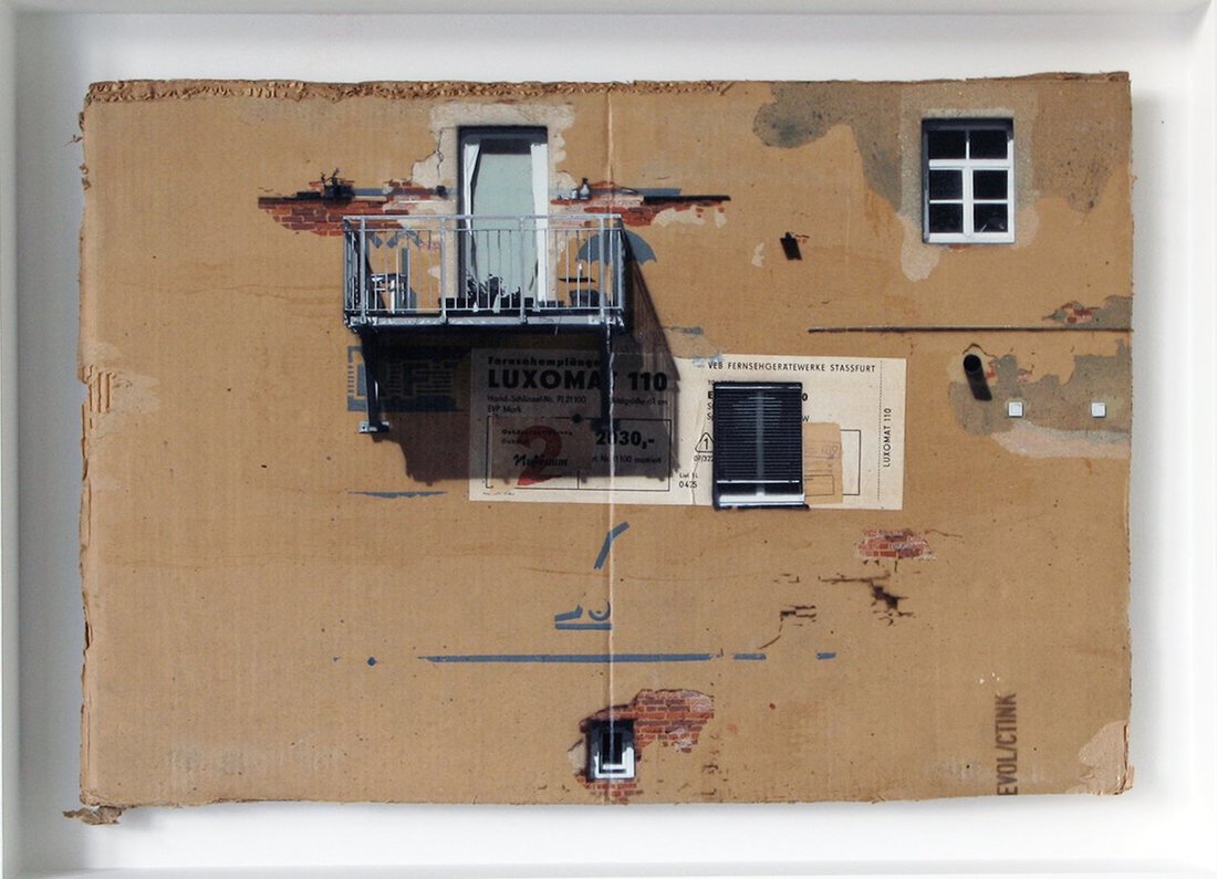
EVOL
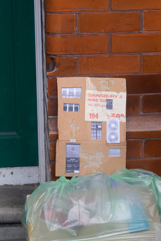
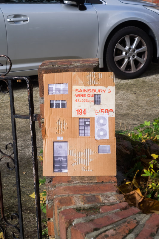
Evol is a German Street artist who currently works in Berlin. Evol is known for his street installations and works on old carboard as shown below. Evol makes these cardboard compositions using printed out graphics with bits of tape and other objects compiled on to distressed cardboard. He does this to reflect the distressed and battered of an urban city.
This is quite hard to get right as it is important you distress your cardboard in ways that it make s it look more rustic and like a real wall would be like. I think the work of Evil is a very good way of mixing photographs in with other, more experimental mediums. His works shows he is familiar with his city's urban landscapes. I think his use of cardboard is a nice way of presenting photographs on.
This is quite hard to get right as it is important you distress your cardboard in ways that it make s it look more rustic and like a real wall would be like. I think the work of Evil is a very good way of mixing photographs in with other, more experimental mediums. His works shows he is familiar with his city's urban landscapes. I think his use of cardboard is a nice way of presenting photographs on.
|
|
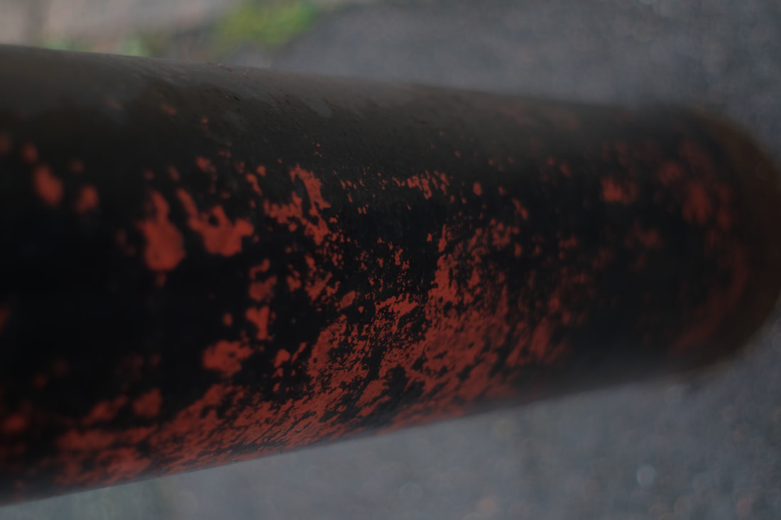
These are my chosen images cropped and compiled into two A4 sheets which will later be cut out and stuck onto our piece of cardboard.
|
|
|
|
|
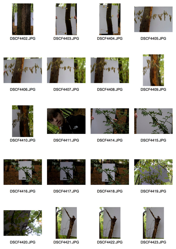
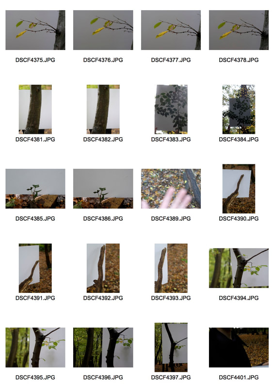
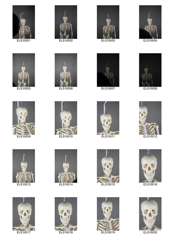
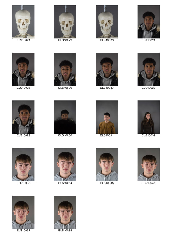
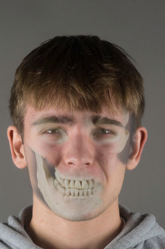
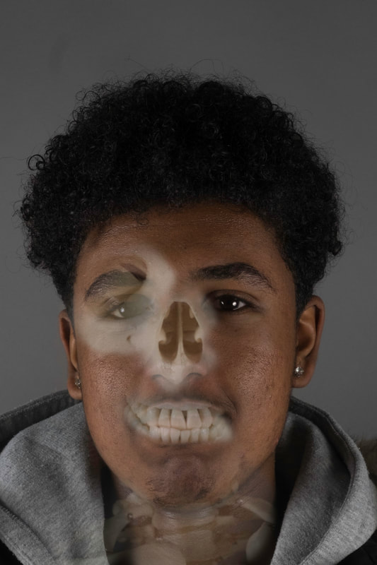
structure of a body
In this task we were required to blend two different images together in photoshop to try and depict the structure of a body that isnt exactly visible to the human eye. We had to create a sort of X-ray effect with photoshop. First we took pictures of our skeleton with even soft lighting. For this we used two soft boxes either side. We then took straight on images with a white background to make it easier to edit later. We then took some more images but instead of a human subject with same lighting
|
|
|
|
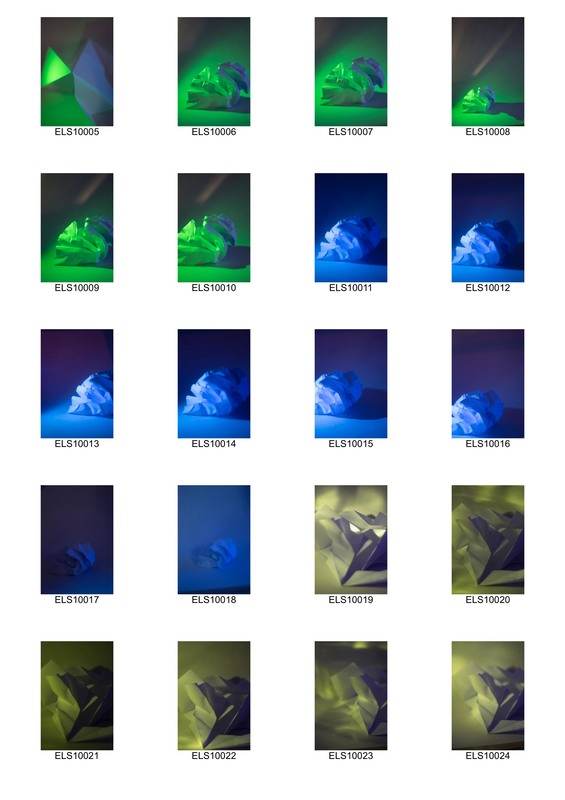
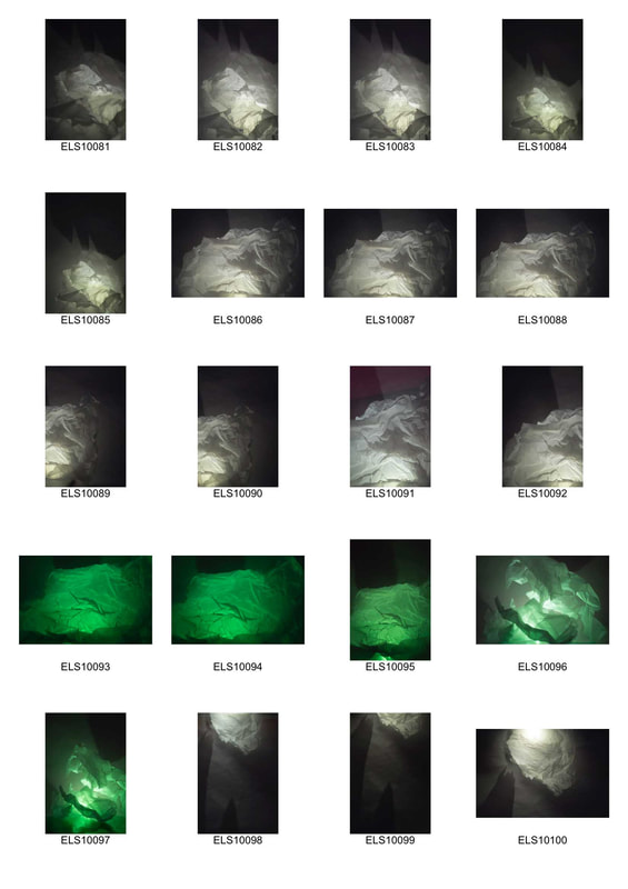
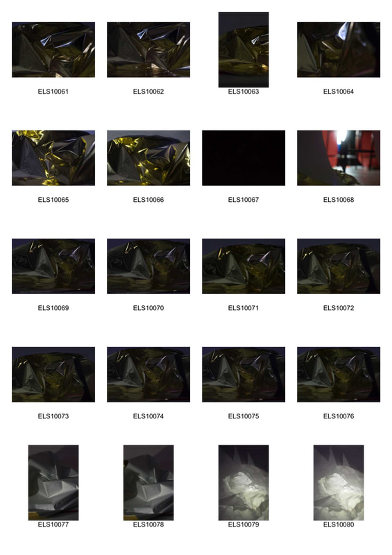
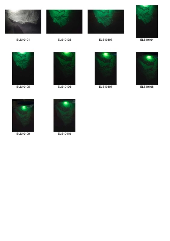
Abstract structure
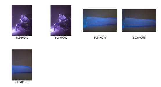
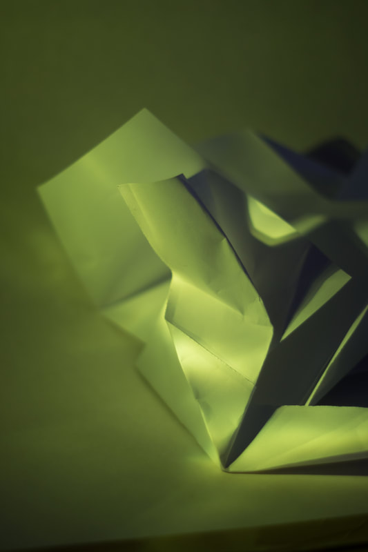
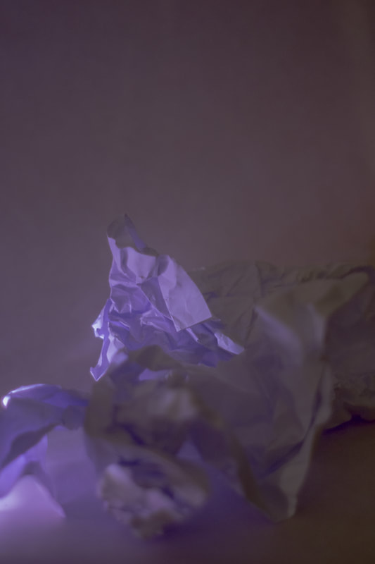
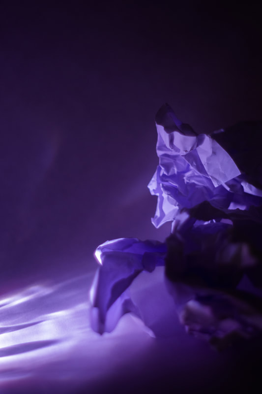
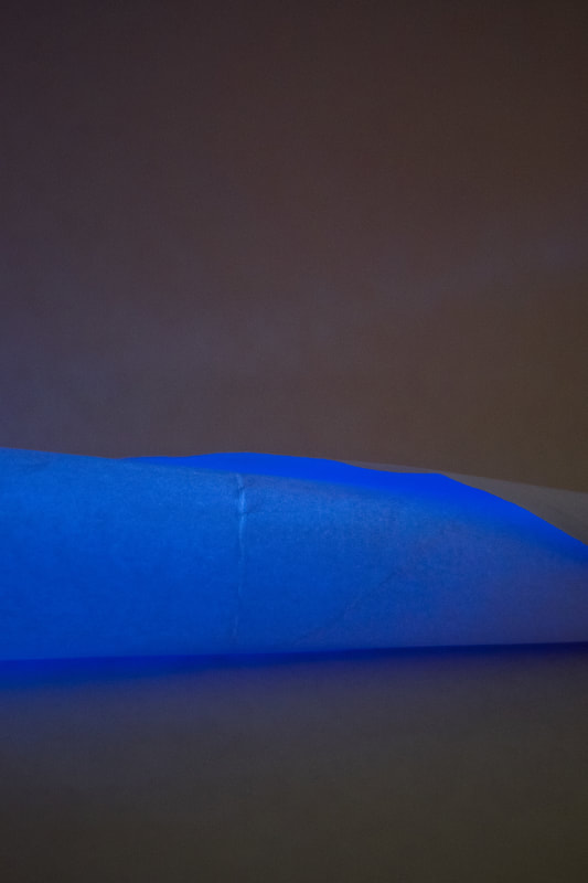
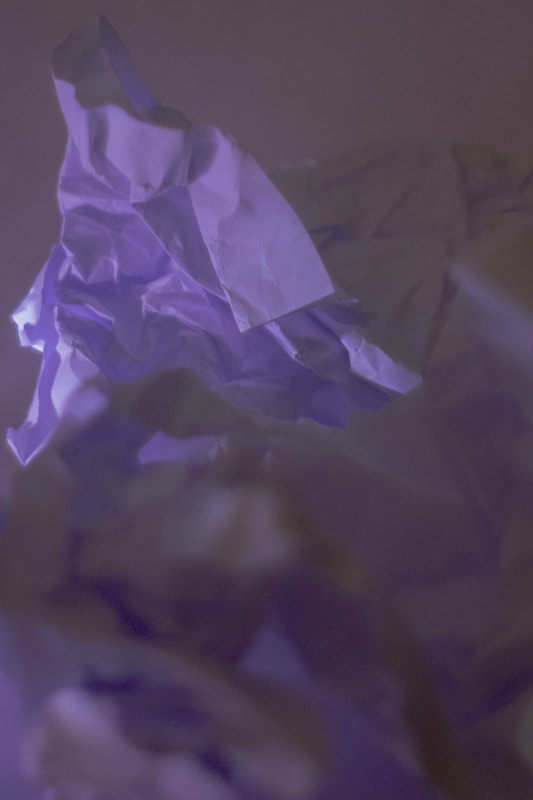
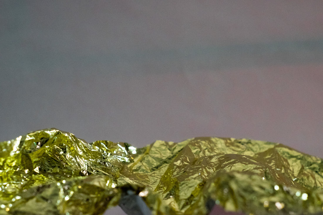
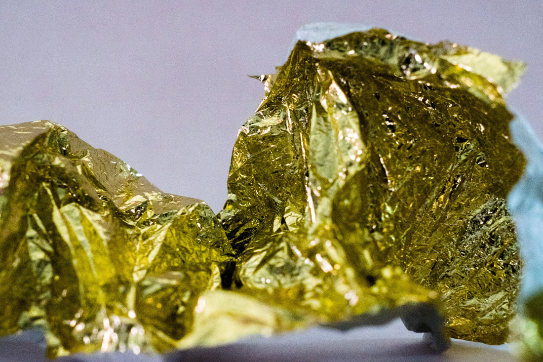
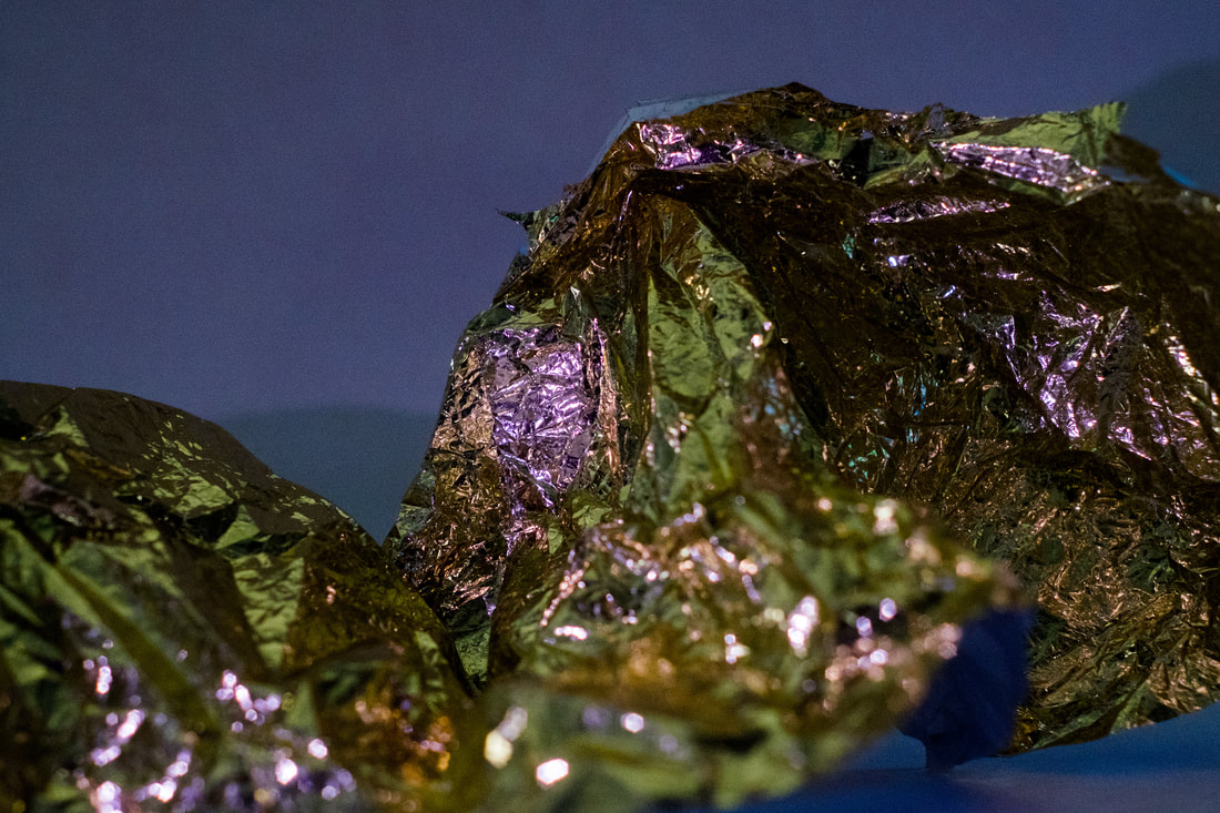
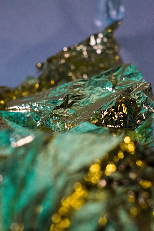
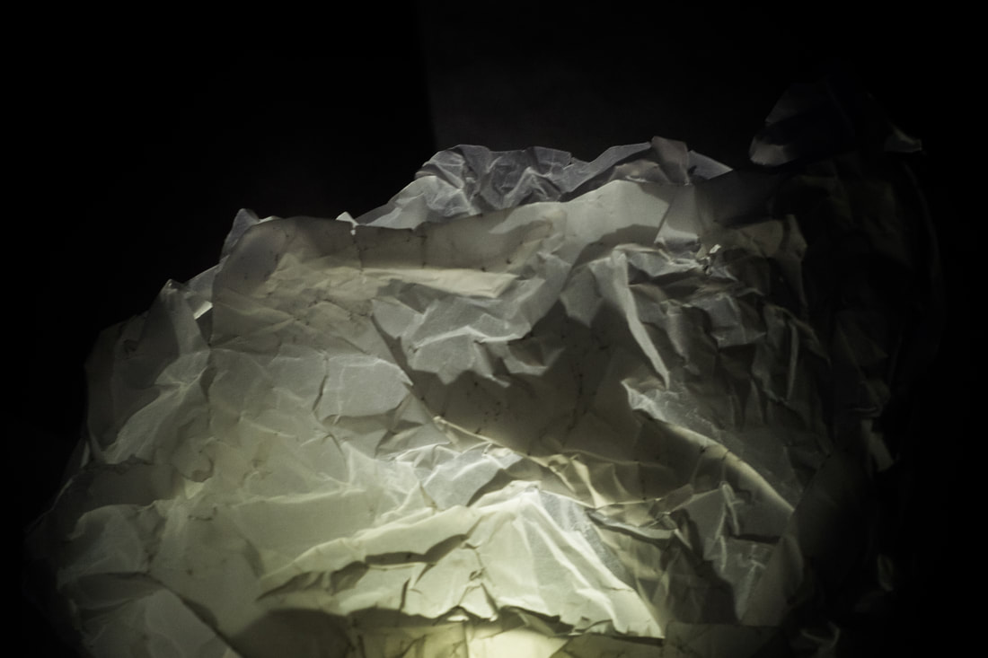
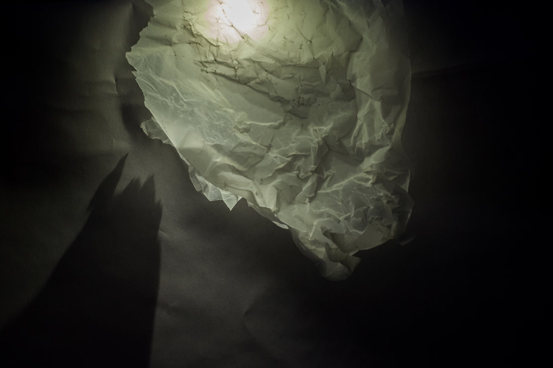
The aim of this task was to start to get us thinking about the effects of light and how we can use light to create different images. To do this we used the torch on our phones with the room lights completely off so it was visible. We also experimented with different light gels in an assortment of different colours
|
|

|
|
Cropped images
|
|
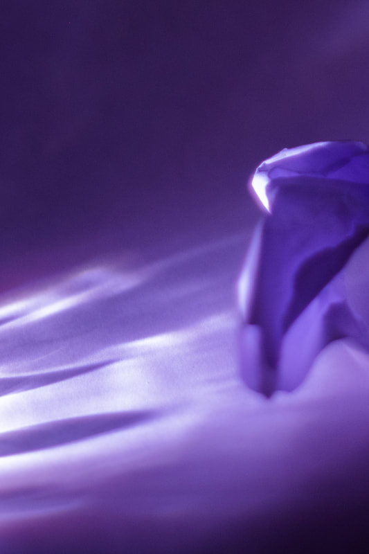
Overall, I think my first shoot was successful. I managed to create some interesting effects by using various transparent objects to shape and distort the light that created the shadows. Not only did I use the various gels to change the colour of the light but I also used transparent objects such as water bottles to create different shapes and textures of light. An example of this is below.

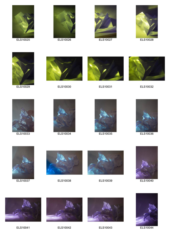
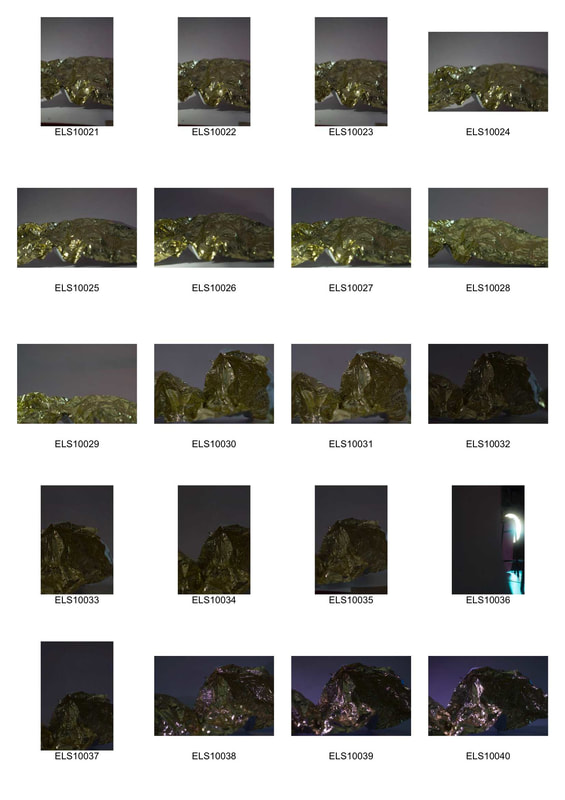
2nd shoot
|
|
|

|
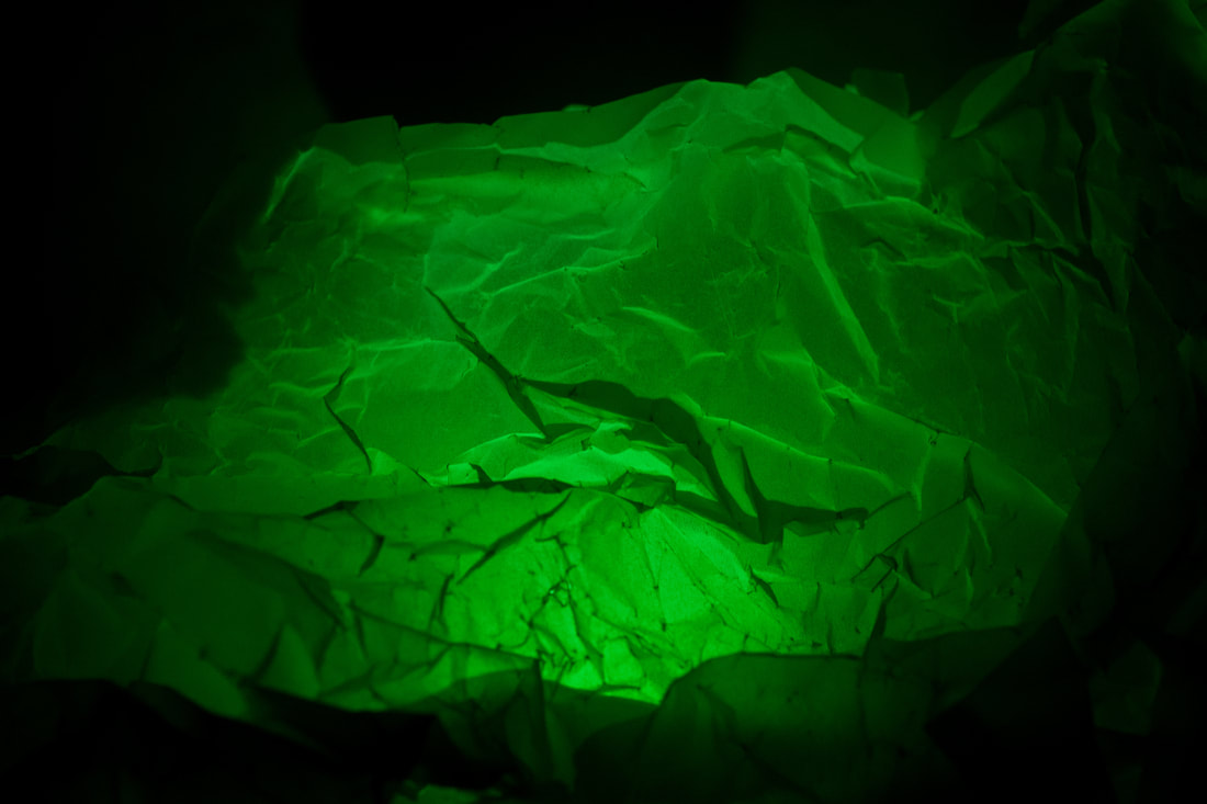
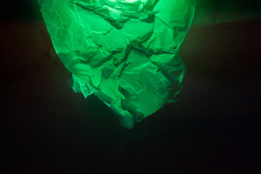
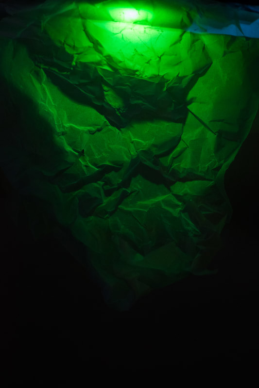
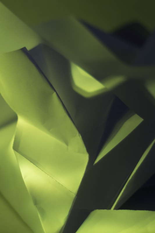
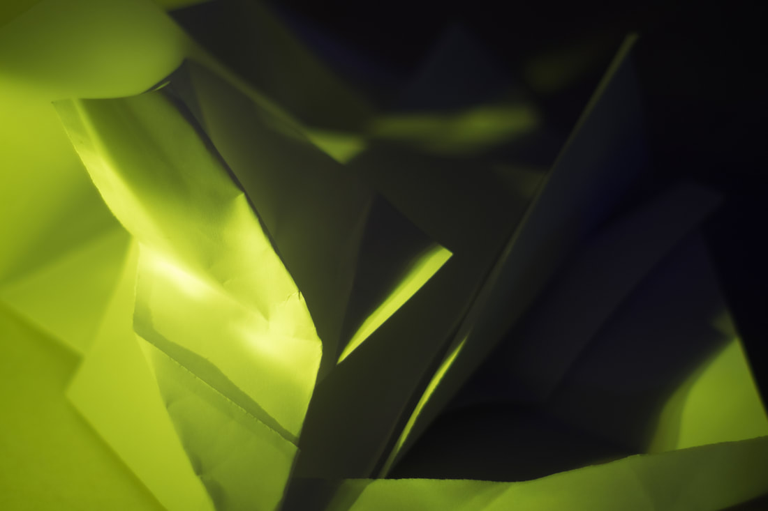
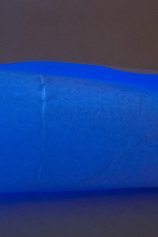
I think my second shoot went a lot better than my first. I began to use different materials in order to cast more interesting shadows and create different textures of light and shadow. I also blocked some of the light to create a better contrast between the lights and the darks. These pictures created very interesting shapes that almost look like landscapes of mountains. The coloured gels create a modern look that really bring the image out.
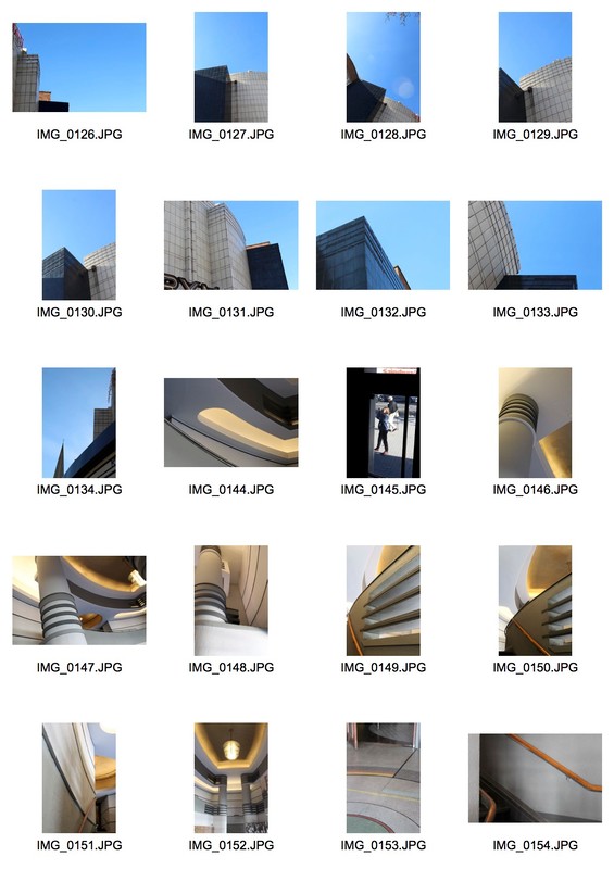
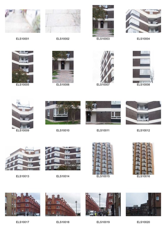
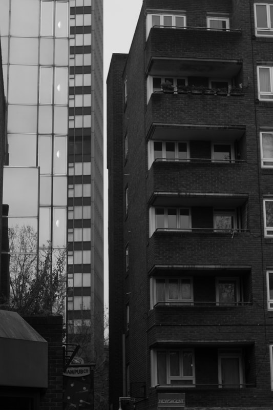
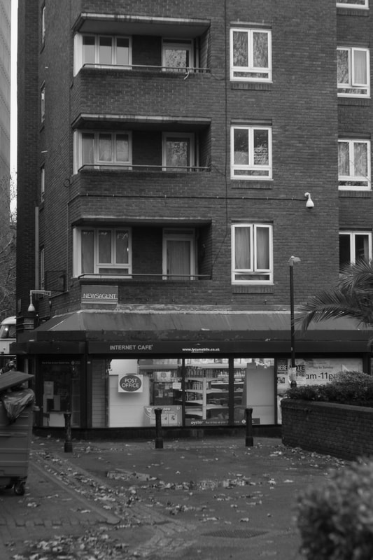
First STRAND - structure of buildings/socially
|
|
For this strand my aim was
Second strand - Abstraction of structure in urban area
Examples in slideshow...
|
|
|
|
gary winogrand b&w
henre cartier brason
henre cartier brason
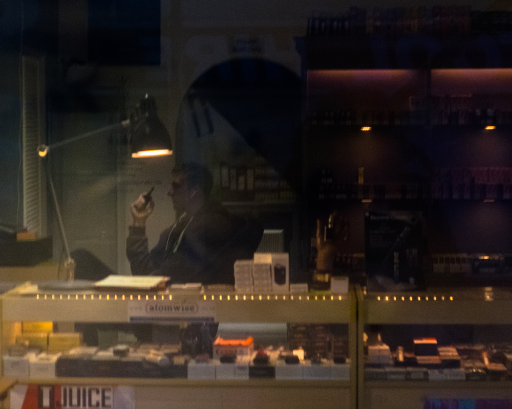
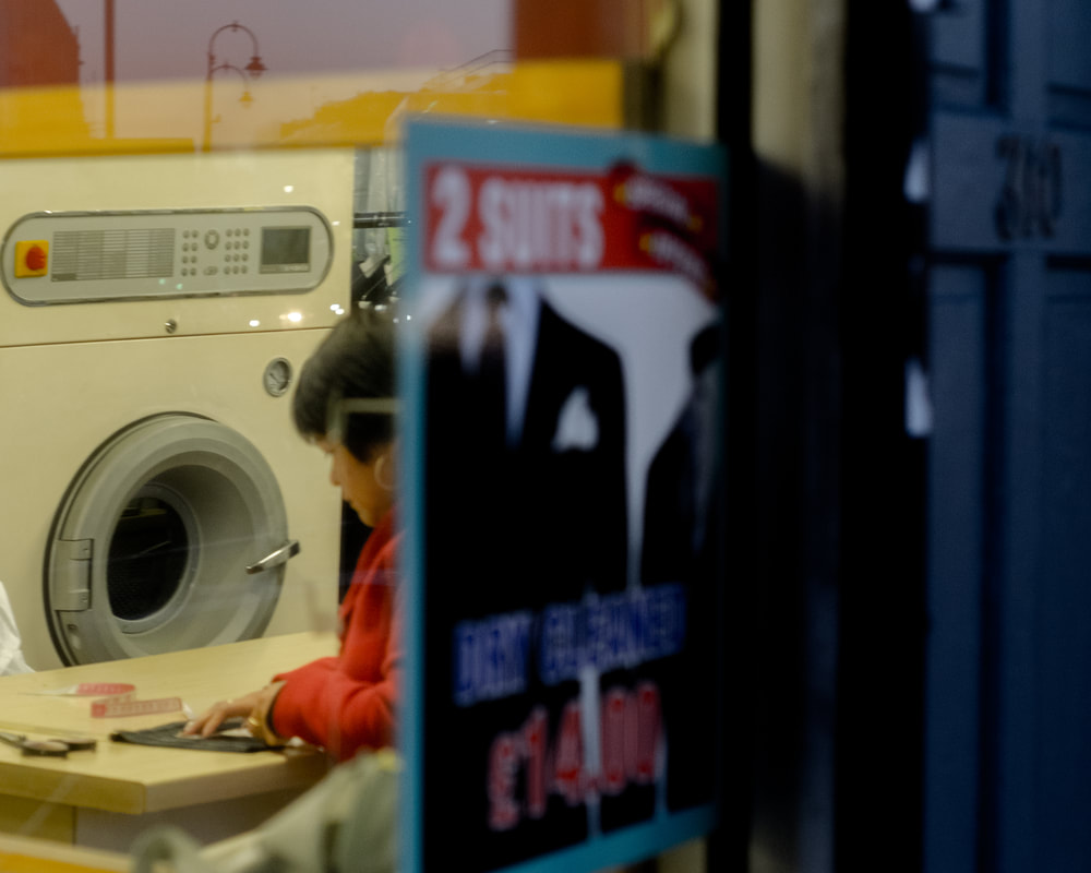
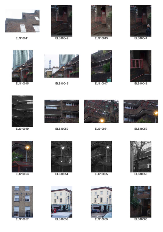
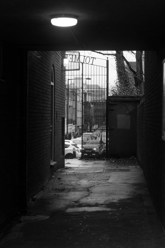
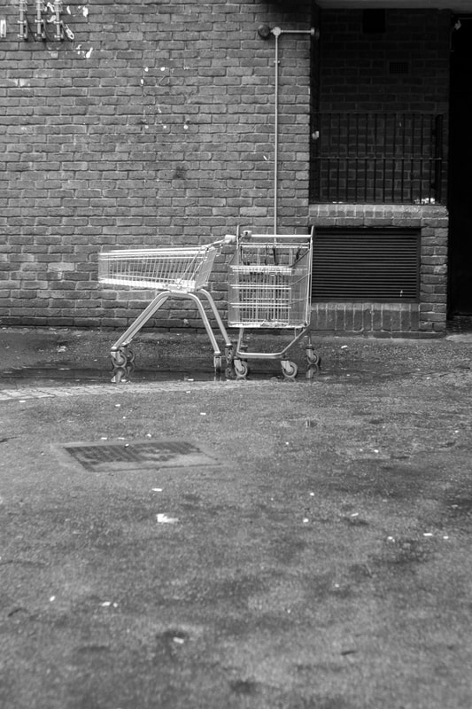
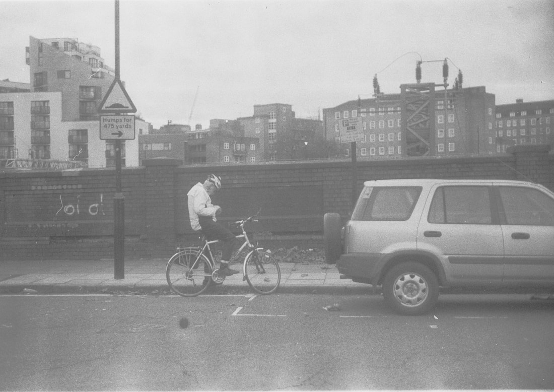
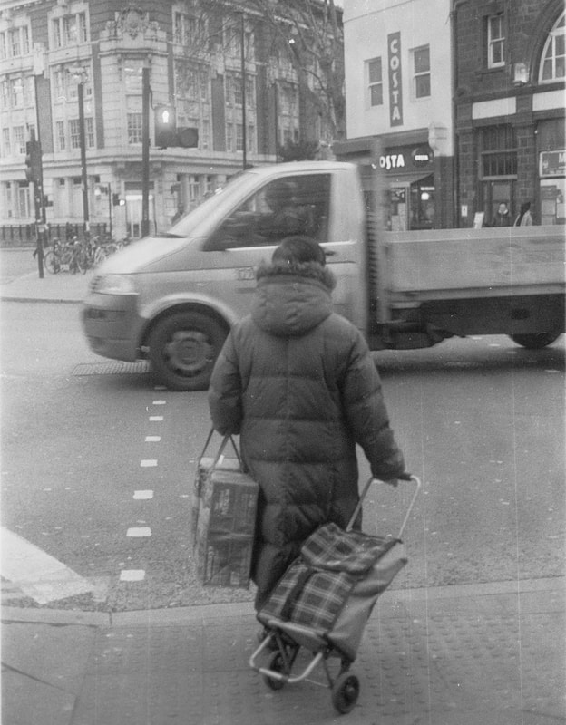
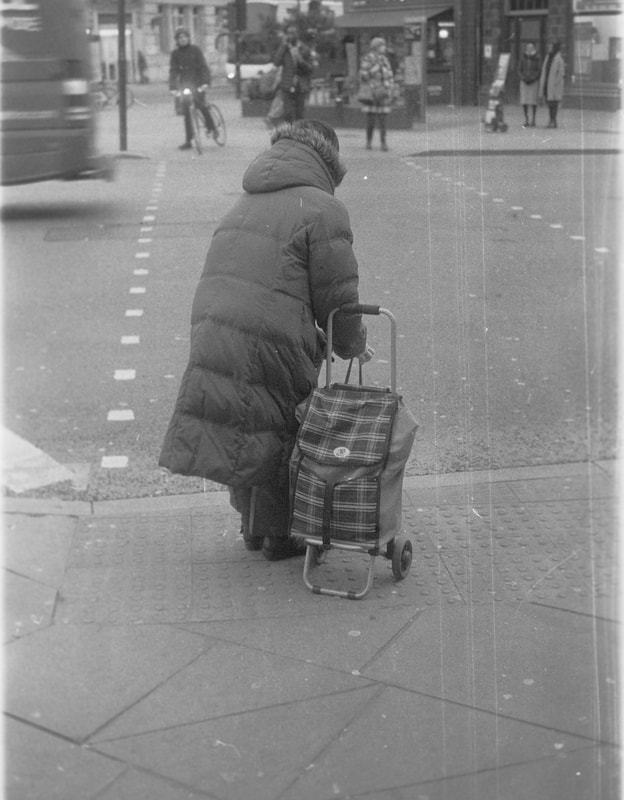
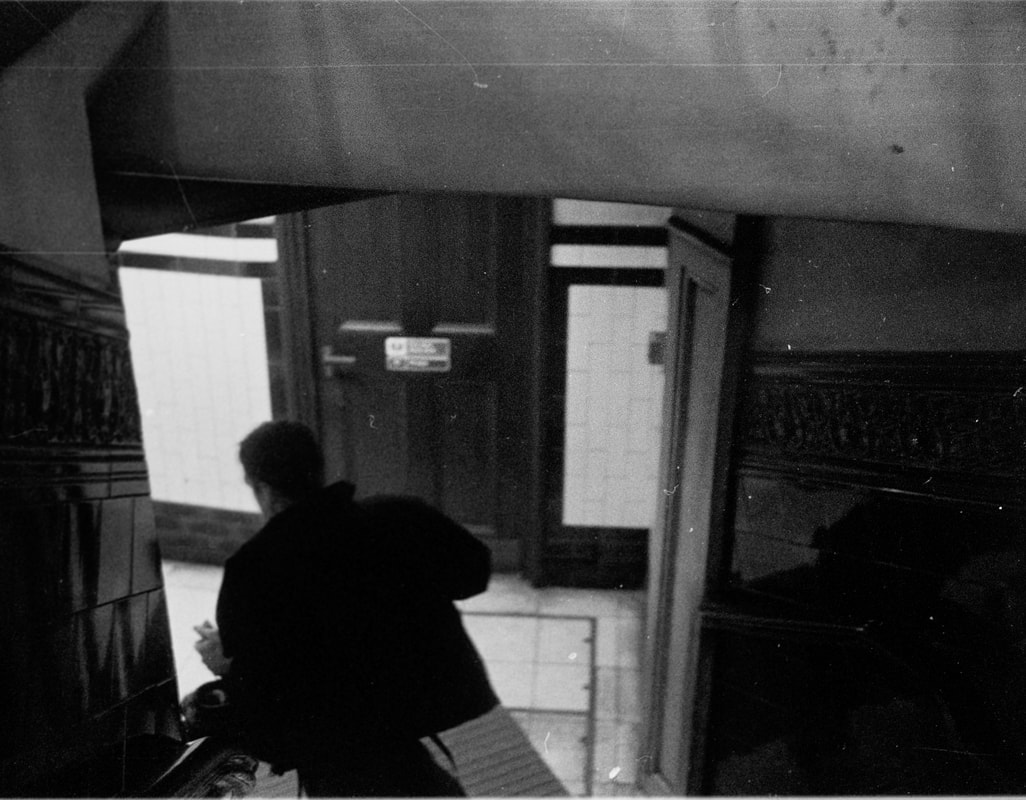
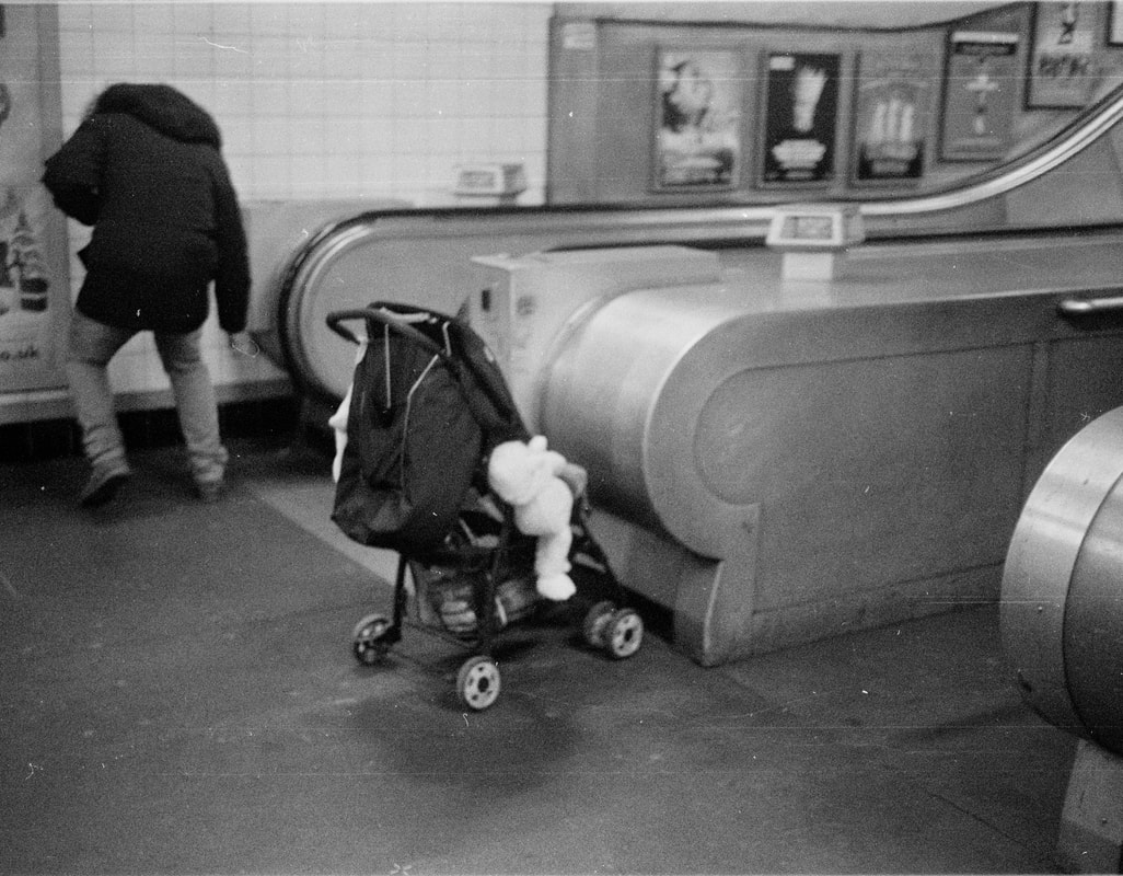
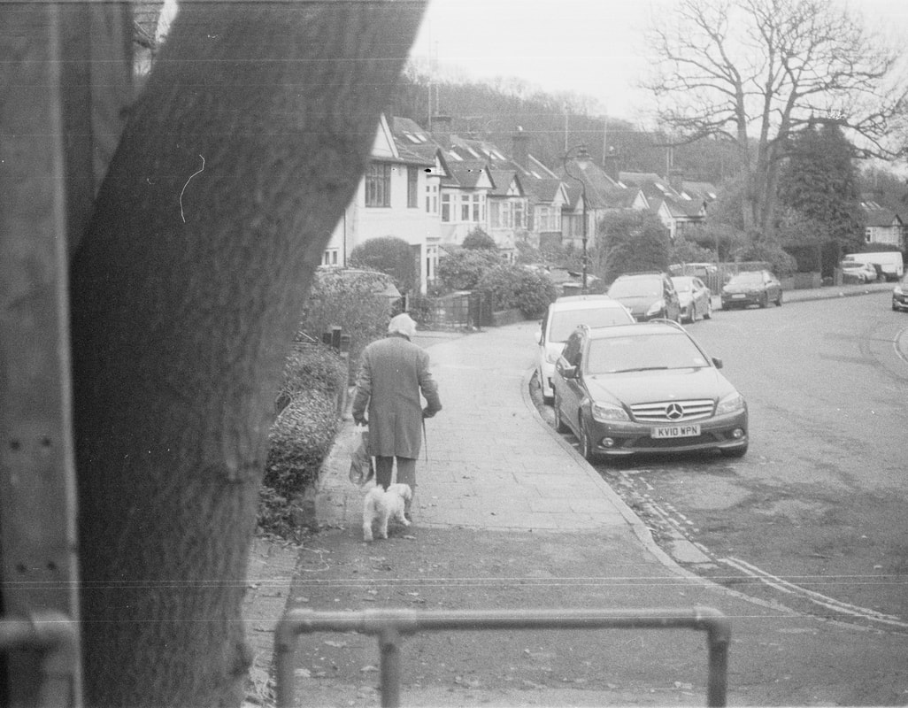
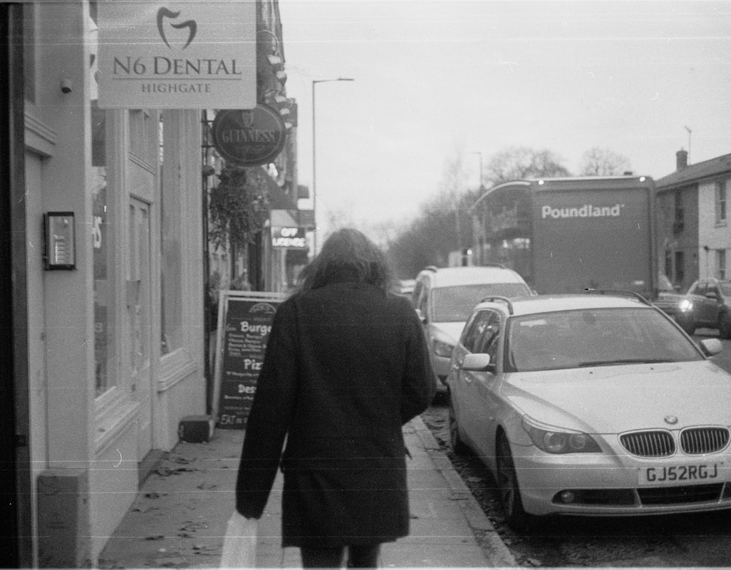
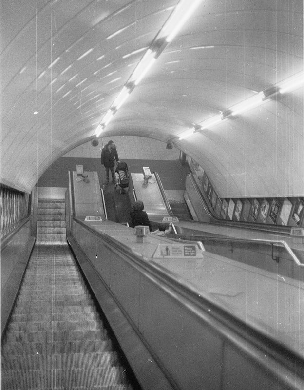
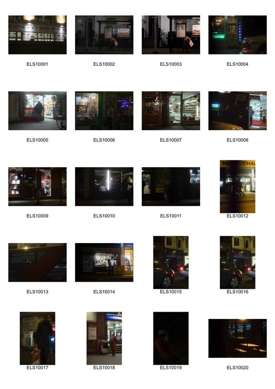
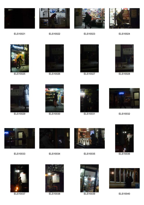
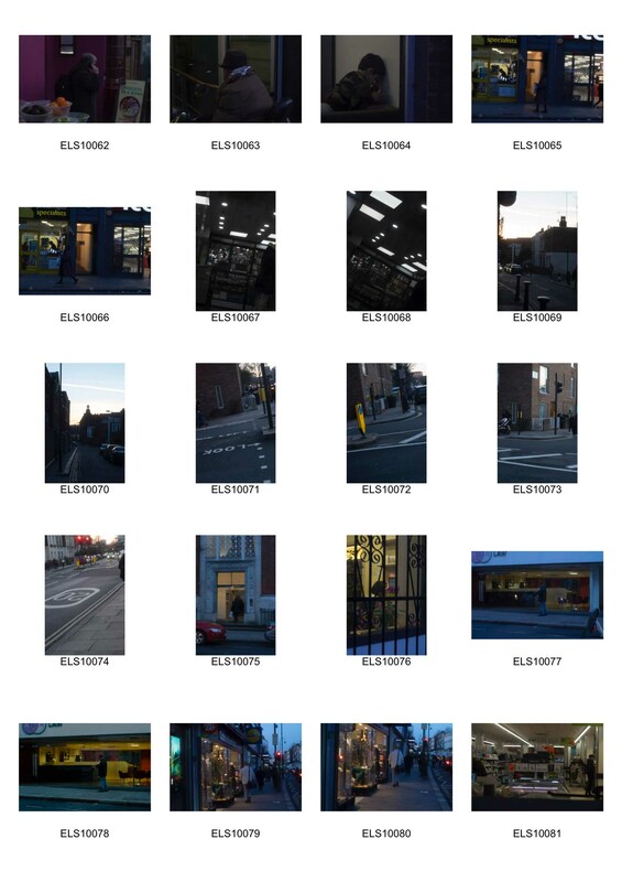
third Strand - Street photography/social structure
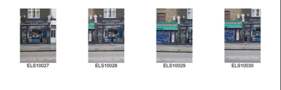
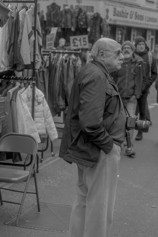
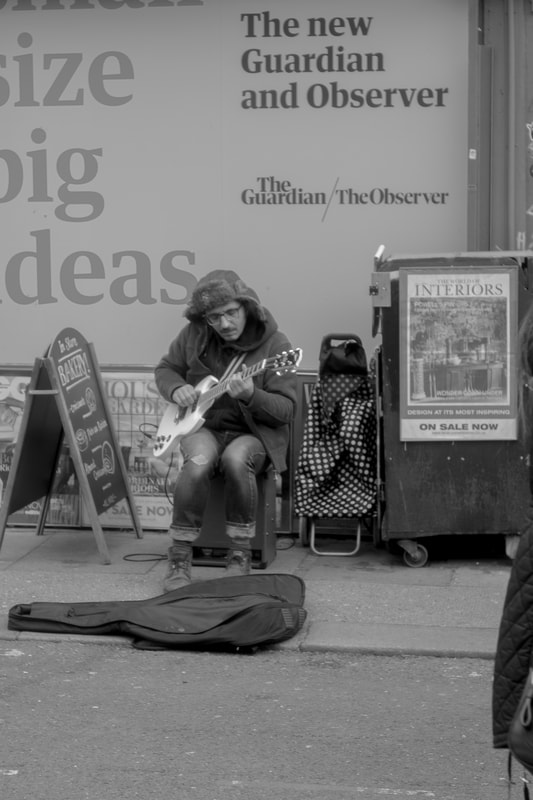
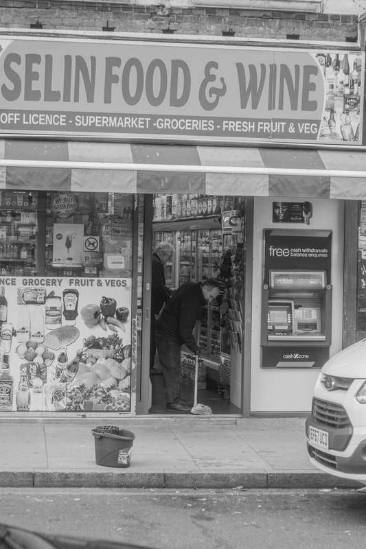
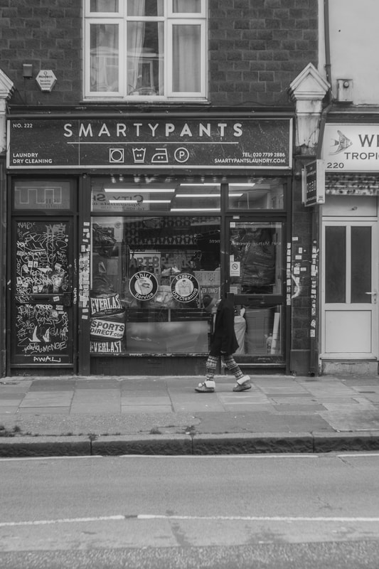
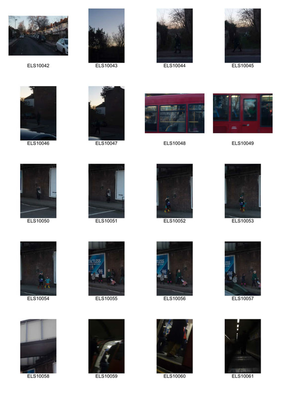
Film Experiments....(please note..these were taken before the digital images so this was my first set of images)
development 3
|
|
|
|
mono printing workshop
Mono printing is a physical process of printing a line drawing using ink. This process is most commonly used in art. The process is quite lengthy and demanding of patience. The process begins with the image being printed out. I chose to use an image of architecture as it is quite simple in its form and structure. To begin the process, ink must be applied onto a rolling matte with an ink roller. Before moving onto the next part you have to make sure your roller has been fully applied with ink. Next turn your printed image so that the back is facing up. Then apply the ink so that it coats the entire back evenly. Once this has been applied it is important you work quickly so that it does not dry out. Use newsprint to remove the excess ink by laying it on the inked side and rolling with a dry roller. This will get rid of most of the ink so it doesn't smudge onto your final print later on. Repeat this until the ink is evenly coated and not too thick. Next lay the inked side faced down onto a plain piece of paper or your choice of paper. Use a pen or a pencil to trace the image, when doing this be careful not to lean on the paper as this will show up. After you have drawn over everything lift you image so that the final print is revealed. Below are my first mono prints produced
This first print was probably the most unsuccessful. I chose an image that was way too complex and not very readable once printed. I used a ruler but failed to keep the lines straight without leaning on the ruler too much. I excluded the person in the image as I thought it might ruin it but I think it would have given it some scale and context so I regret not including the person from the photograph.
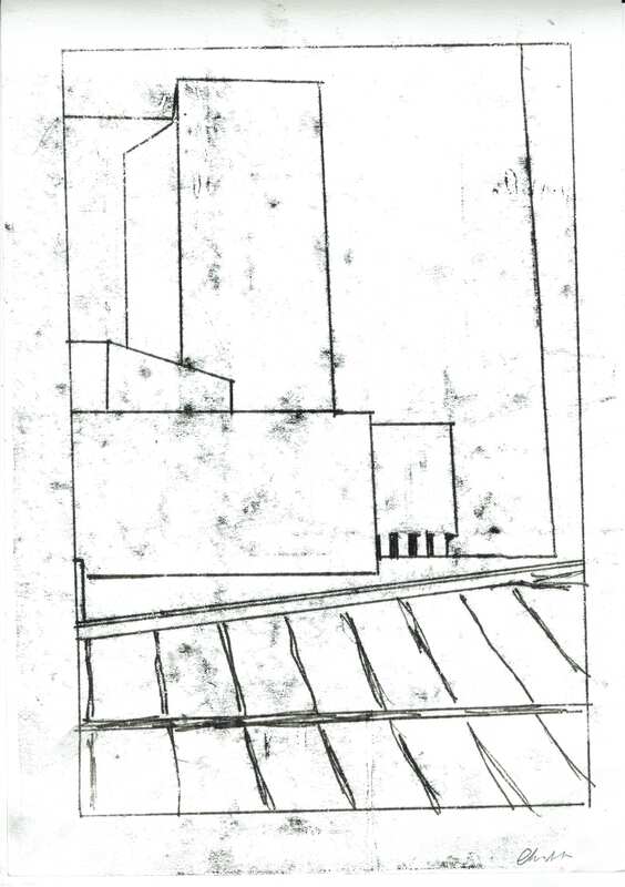
This image was a far more successful one. I chose a very simple building structure and decided to not use a ruler for some parts and sketch it. I think this worked nicely as it made it look a bit more like a drawing and stopped it looking untidy. However I did not pay attention to how much I was leaning on the image so it came out very messy and smudged. I don't believe this ruins the image as it is quite hard to avoid and I think it adds to the rawness of this process of printing.
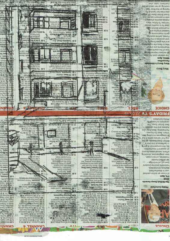
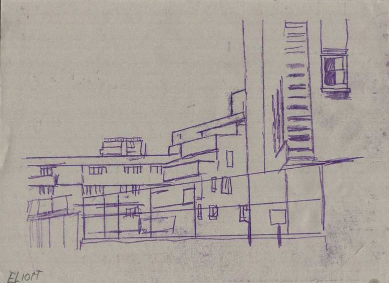
The next two prints were the most successful and where also my favourite compositions. The first one was printed on newspaper. I did this too make the background slightly more interesting and I think it did a good job of making the print have more life and depth to it. I refrained from using a ruler to make it look more sketchy as I think that its a nicer effect. The smudges were still visible but less noticeable due to the background. The second print I experimented with different colour inks. I made some test papers to figure out what colour would look good on which background and then decided to go with purple ink. The paper had a slightly more unbleached colour which made it look slightly creamer which made it look good with the purple. I used a ruler for the bigger lines but drew freehand with the smaller parts. I think this print was a mix between all of the things I had learnt in the previous prints and all came to gather to produce one print that I was overall happy with. There were less smudges and wonky lines and the composition came together very nicely.
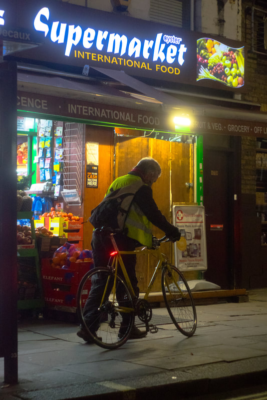
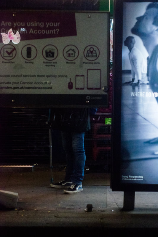
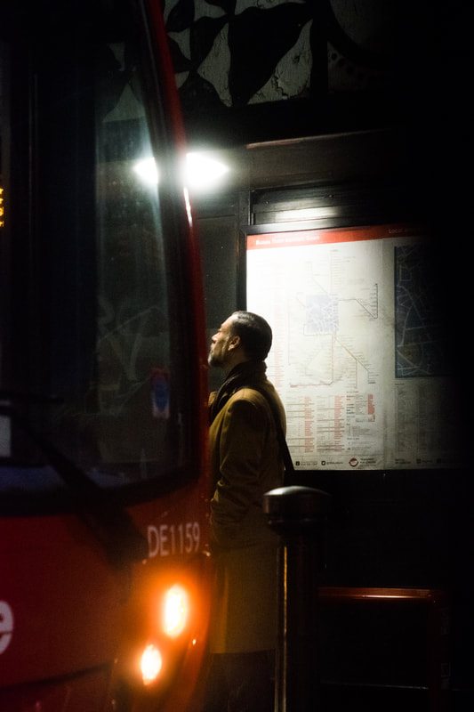
final development/ final pieces
|
|
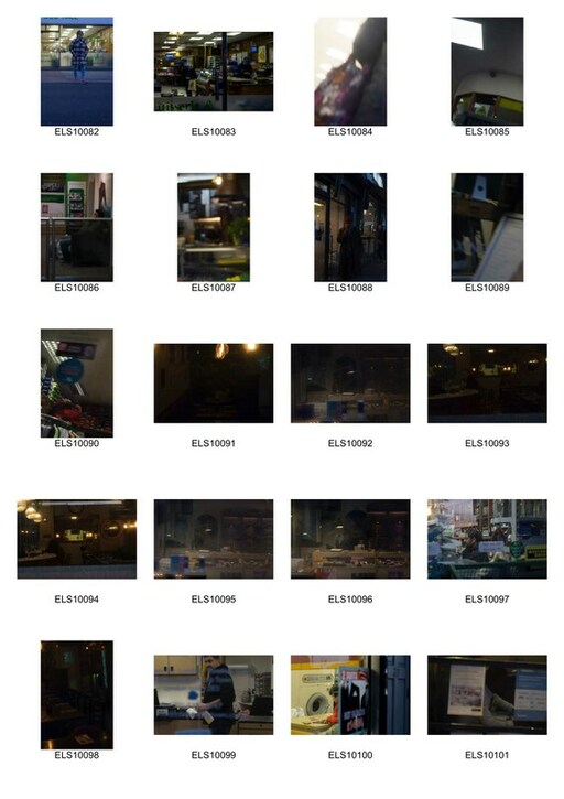
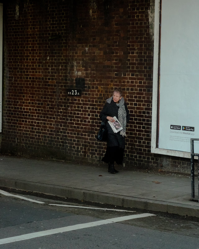
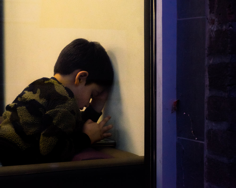
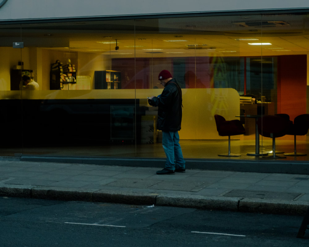
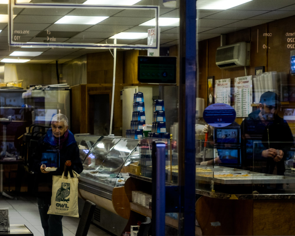
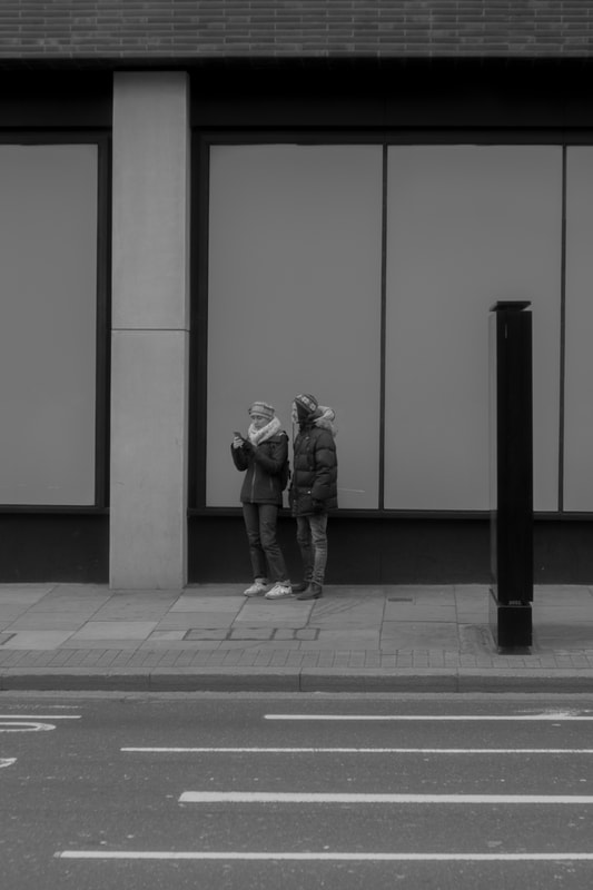
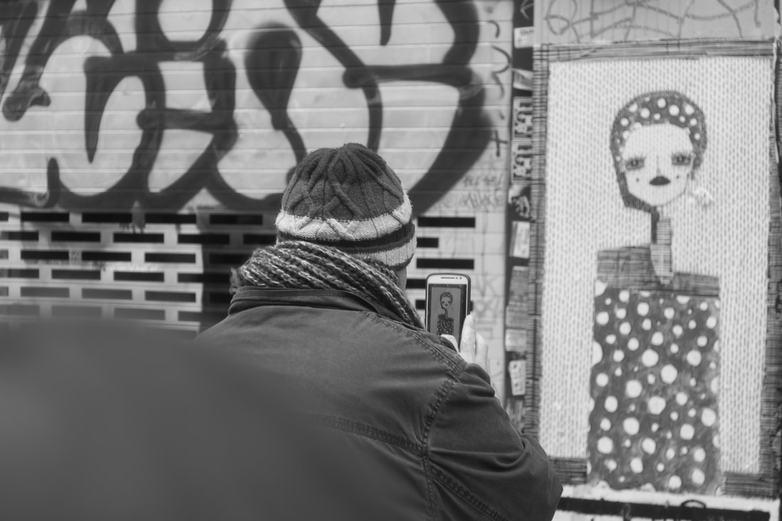
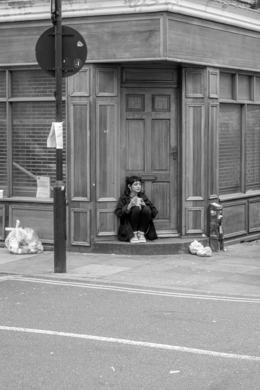
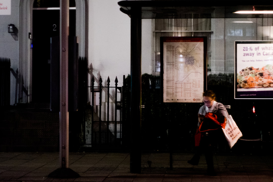
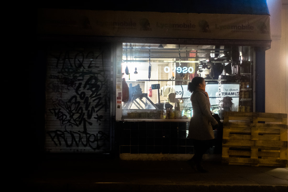
Below, are my final outcomes for the strand I decided to develop. I decided to make all the pictures in a 4x5 format. I did this because I feel like this format allows the viewer to have a more intimate viewing of the picture while it also makes the connection between the viewer and the subject of the photograph more intimate. Taking pictures in a city like London can sometimes result in flat photographs when taken in daylight. The very diffused lighting of overcast days are mostly suited to black and white. Instead I decided to take this photographs towards the end of the day when the sun was setting. This, mixed with the glowing lights of a high street allows me to capture images with more interesting light and is my favourite time to capture street photography. When capturing a moment of someone else life you are choosing a time and a place that is somewhat important to them. The place can tell just as much about that person as the actual subjects expression can. I wanted to make sure my photographs have a background that was describing the moment of that persons life.